In a recent bulletin, I argued that public-sector unions impose various costs and burdens on state and local governments. Here is some more evidence.
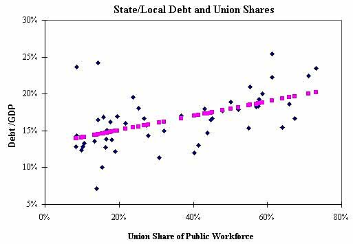
The chart below shows a scatter plot of the union shares in state/local government workforces and state/local government debt levels as a share of state gross domestic product. Each blue dot is a U.S. state.
The variables are correlated — as the union share increases, a state tends to have a higher government debt load. The chart shows the fitted regression line in pink dots (R‑square=0.27; F‑stat=18; t‑stat on the union share variable=4.2).
The correlation is likely caused by the fact that unionized government workers are powerful lobby groups that push for higher government-worker compensation and higher government spending in general.
(Thanks to Amy Mandler for data help and Andrew Biggs for suggestions. Andrew’s work on state debt is here).