Yesterday the annual summary of SAT—formerly Scholastic Aptitude Test—scores came out, and the news was once again disheartening. Indeed, average reading scores hit a record low, and math remained stagnant. Writing scores also dipped, but that part of the test has only existed since 2006.
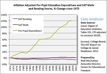
There are important provisos that go with drawing conclusions about the nation’s education system using the SAT. Most notably, who takes it is largely self-selected, and growing numbers of people sitting for it—some of whom might not have bothered in the past—could lower scores without indicating the system is getting worse. That said, as the chart below shows, no likely amount of self-selection or changing test-takers can account for the overwhelming lack of correlation between spending and scores. Per-pupil outlays have taken off like a moonshot while scores have either sat on the runway, or even burrowed down a bit.
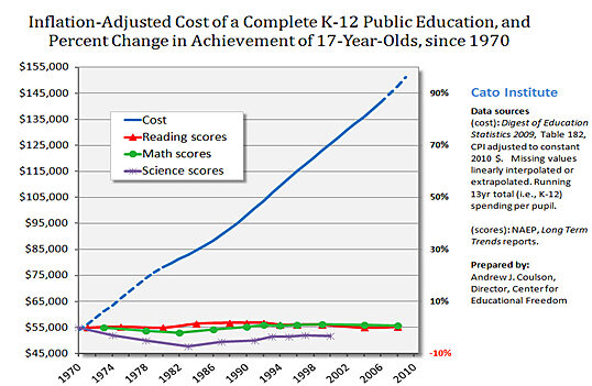
Sadly, this corresponds to the results from long-term National Assessment of Educational Progress exams—which are nationally representative—for 17-year-olds. Again, as the following chart reveals, spending has skyrocketed while scores have, um, decidedly not skyrocketed.
There are factors that make comparing year-to-year SAT scores imprecise. But the trend clearly reinforces what we should already know: we get almost no return for our education “investment.”


