The whole idea of “core” inflation seems phony to most people – a poor excuse to make high inflation look better. How could anyone possibly leave costs of food and energy out of inflation measures? Don’t people have to eat and drive?
This objection is understandable and also correct for most purposes. Yet too broad a measure of inflation can be misleading and too ambitious when Federal Reserve officials allude to that statistic as a target and a rationale for manipulating key interest rates.
The trouble is that any “all-items” index of consumer prices will frequently exaggerate the typical or “underlying” trend of inflation – typically by being dominated by extreme swings up and down in global prices of energy and food commodities. This can make apparent “headline” inflation over the past 12 months dangerously misleading as a guide to future policy for the next 12 months.
The first graph compares year-to-year changes in the all-items PCE index (for personal consumption expenditures) with two alternative measures of the less-volatile core inflation rate. One is the Fed’s preferred Core PCE index from the Bureau of Economic Analysis (BEA). The other is the Trimmed-Mean PCE index from the Federal Reserve Bank of Dallas. The Trimmed-Mean index excludes the most extreme price increases and decreases to focus on more typical and less volatile price changes.
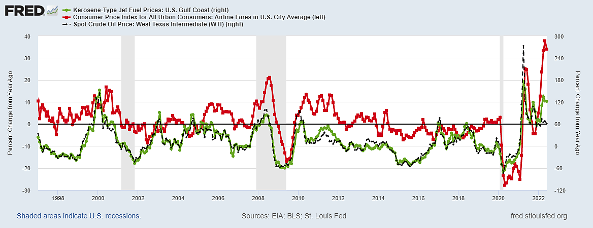
In the consumer price index (CPI), for example, airline fares rose 12.9% in May and fell 2.5% in June, though neither number could possibly indicate a trend. The Core CPI includes airline fares and other public transportation as “services less energy” despite their evident connection with global oil prices. But such big monthly swings in airline fares (or anything else) are excluded from the Trimmed-Mean PCE inflation as too volatile to be meaningful. Prices of dental services rose 1.9% in June after falling in April, which might also be too volatile and abnormal to be included.
The note uses two graphs to illustrate the practical necessity of focusing on trimmed-mean or core PCE inflation for timing Federal Open Market Committee (FOMC) decisions to raise and lower the federal funds rate (The FOMC has never raised the fed funds rate without lowering it before long). I plan to write a follow-up, offering more charts with variables that seem to better explain past federal fund rate cycles more clearly than core inflation – namely, employment or unemployment rates and crude oil prices.
The first graph begins with June 1983 and ends with May 2022 because this has been a period of relatively moderate core inflation compared with 1973–82. Specifically: Core inflation as measured by the Trimmed-Mean never exceeded 4% since June 1983 and never fell below 1.5%.
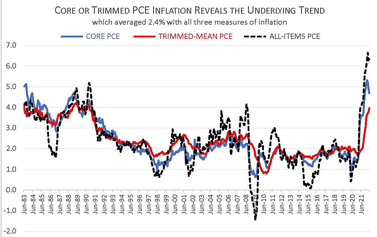
The most important thing to understand is that the long-run average of core or trimmed inflation is no lower than it is for the all-items PCE index. Since mid-1983, all three measures averaged the same 2.4% a year. A proper core price index does not make inflation look lower over time – only less erratic.
As the black line shows, the all-items measure of inflation did not just rise much higher than core measures half a dozen times (when oil prices spiked), it also fell much lower than core inflation in the following year or longer.
The trimmed-mean and PCE core inflation rates iron-out ephemeral peaks and valleys in headline inflation, leaving multi-year averages the same. That is what is meant by using core inflation to reveal the “underlying trend” – which was 2.4% for the last 39 years and most likely for future years as well (since it is such a well-established trend).
Read the rest of this post →