In the Wall Street Journal yesterday, Alan Reynolds pointed out some of the flaws in the data being used in the income inequality debate. Far too many policymakers, analysts, and reporters assume that the data showing rising inequality is carved in stone, but it isn’t. Some portion of the supposed change in income inequality in recent decades is a statistical artifact due to changes in marginal tax rates and other factors.
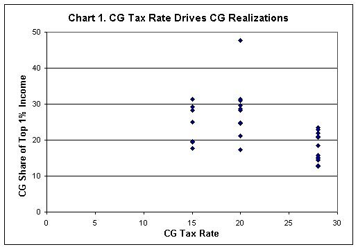
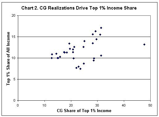
One of Alan’s points is that fluctuations in capital gains (CG) realizations by the top 1 percent of earners plays an important role in that group’s measured income share out of total American income. I constructed two charts with Alan’s data to illustrate the point. The two charts are scatter plots using data from 1979 to 2009.
Chart 1: Lower CG Tax Rates Lead to Higher CG Realizations for the Top 1%. In years when we had a higher 28 percent CG tax rate, the share of high earners’ income from CG is lower. In years when we’ve had lower 15 and 20 percent CG rates, the share is higher.
Chart 2: Higher CG Realizations Increase the Measured Share of the Top Earners’ Income. In years with lower CG tax rates, high earners realize more CG, and that inflates their measured share of total American income.
(Note for data wonks: Regressions on these two relationships were highly statistically significant, i.e. high F‑statistics).

