The Current Wisdom is a series of monthly articles in which Patrick J. Michaels and Paul C. “Chip” Knappenberger, from Cato’s Center for the Study of Science, review interesting items on global warming in the scientific literature that may not have received the media attention that they deserved, or have been misinterpreted in the popular press.
With all the stern talk about global warming and widespread concern over climate change, you would think that we humans would have a propensity for cooler temperatures. Everywhere you look, the misery that rising temperatures (and the associated evils) will supposedly heap upon us seems to dominate reports about the coming climate. But do patterns of population movement really support the idea that we prefer cooler locations?
Increased Mobility
Since 1900, the population of the United States increased from about 76 million people to about 309 million people in 2010. Accompanying that population growth were major advances in technology and industry, including vast improvements in our nation’s system of transportation. As planes, trains, and automobiles replaced the horse and buggy, Americans became more mobile, and where we live was no longer connected primarily with proximity to where we were born. Instead, we became much freer to choose our place of residence based on considerations other than ease of getting there.
Where has our new-found freedom of mobility led us? Figure 1 shows the rate of population change from 1900 to 2010 for each of the contiguous 48 states. Notice the increases in states with warm climates such as Florida, Texas, and California, and also in states with big industry (that is, jobs), such as New York, Michigan, and Ohio for example.

Figure 1. The state-by-state population trend (people/year) from 1900 to 2010 (data from U.S. Census Bureau).
Which states are people less likely to choose to live in? States such as North Dakota, South Dakota, Montana, Maine, Vermont—all of which have harsh climates and low temperatures.
Comparing a map of the change in population (Figure 1) with a map depicting the average temperature of each state (Figure 2) reveals a pretty strong indication that people seem to be seeking out warmer states.
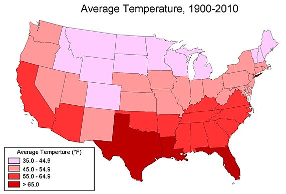
Figure 2. The state-by-state average annual temperature for the period 1900–2010 (statewide temperture data available from the U.S. National Climatic Data Center).
Experiential Temperature
Another way of looking at human temperature preferences is to calculate what we’ll call the “average experiential temperature”—that is, the annual temperature that the average person living in the lower 48 states experiences each year. We can calculate this value by first multiplying the average temperature in each state during a particular year by the state’s population in the same year. Then we sum this product across the 48 contiguous states, and finally divide this sum by the total population of the country. In other words, the temperature in states with larger populations weigh more heavily on the national composite experiential temperature than does the temperature in those states with sparser populations. As the population of the country redistributes itself over time, we can track how the average person’s climate changes.
When we do that for each year from 1900 to 2013, we get the result shown in Figure 3—a steadily rising temperature. In fact, the average experiential temperature has risen by a total of about 3.85ºF over the course of the last 114 years (a rate of 0.34ºF per decade).
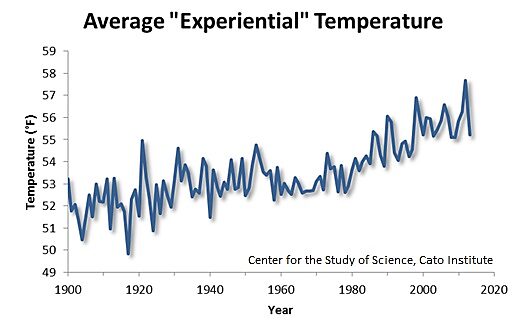
Figure 3. The average experiential temperature of the population of the United States, 1900 to 2013.
But the history of experiential temperatures alone can’t tell us whether the increase has been unwillingly forced upon us by a large-scale warming of the climate from, say, an enhanced greenhouse effect, or whether the change results from Americans seeking out warmer locales on their own accord.
U.S. Average Temperature
To answer this question, we must calculate the area-weighted average temperature of the United States—that is, the combination of the yearly average temperature within each state weighted by that state’s total area. In this case, it is the size of the state, rather than the size of its population, that matters—the bigger the state, the bigger its contribution to the nationwide average.
The result of this calculation is a quite different looking temperature history. In Figure 4, we included the annual U.S. average temperature history along with the annual U.S. “experiential” temperature from Figure 3. We see that, while the United States actual temperature has fluctuated a bit, experiencing warm decades such as the 1930s and 1990s and cold ones such as the 1910s and 1970s, it has increased only slightly during the 20th century—about 0.90ºF (a rate of 0.08ºF/decade).
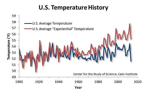
Figure 4. Average temperature of the United States, 1900 to 2013.
For what it’s worth, when you calculate the national temperature this way (using the state-by-state temperature data from the National Climatic Data Center, NCDC), you get a heckuva lot less warming than is in the “official” NCDC record put out by the U.S. Department of Commerce. The difference lies in the “adjustments” plastered on to the original data. Both records are adjusted for a bias known as “time of day” when the previous 24-hour highs and lows recorded. It’s complicated, but it also does slightly alter the data.
But the official version is additionally massaged more than—well, we can’t say in polite company. A laundry list can be found here. The sum of all of those adjustments is to put about twice as much warming in the record as is in our state-averaged plot.
Seeking the Heat
Although there has been a slight warm-up of the actual temperature, that rise is nowhere near the increase in the experiential temperature. In fact, the average experiential temperature has climbed at a rate more than four times that of the U. S. average temperature—which is the experiential temperature had the population distribution not changed at all. That means that Americans have actively been moving to warmer climates. And there is every indication that they are continuing to do so, as evidenced by the strong rise in experiential temperatures during the past 20 or 30 years.
While climatologists have not generally appreciated this fact, it has been long recognized and appreciated by sociologists. As both people’s mobility and their ability to select the climate they prefer have increased throughout this past century, the core of the U.S. population has moved southward—into warmer climates. The overall migration of people into the southern “Sunbelt” states has created a temperature change over time for the “average American” that far outstrips the most pessimistic measurements of global warming for the past century, and rivals the projections for the next!
Apparently, people–or Americans at least–seem to prefer a warmer climate to a cooler one. Next time climate prognosticators warn of the perils of rising temperatures, remember this: when given the means and a choice, some (or rather, most) like it hot!
(Special thanks to Robert C. Balling Jr. and Randy Cerveny, who assisted with early versions of this research.)
