I’ve argued that we’ll get better government if we make it smaller.
And Mark Steyn humorously observed, “our government is more expensive than any government in history – and we have nothing to show for it.”
But can these assertions be quantified?
I had an email exchange last week with a gentleman from Texas who wanted to know if I had any research on the efficiency of government. He specifically wanted to know the “ratio of federal tax dollars collected to the actual delivery of the service.”
That was a challenge. If he simply wanted examples of government waste, I could have overloaded his inbox.
But he wanted an efficiency measure, which requires apples-to-apples comparisons to see which jurisdictions are delivering the most output (government services) compared to input (how much is spent on those services).
My one example was in the field of education, where I was ashamed to report that the United States spends more per student than any other nation, yet we get depressingly mediocre results (though that shouldn’t be a surprise for anyone who has looked at this jaw-dropping chart comparing spending and educational performance).
But his query motivated me to do some research and I found an excellent 2003 study from the European Central Bank. Authored by Antonio Afonso, Ludger Schuknecht, and Vito Tanzi, the study specifically examines the degree to which governments are providing value, and at what cost.
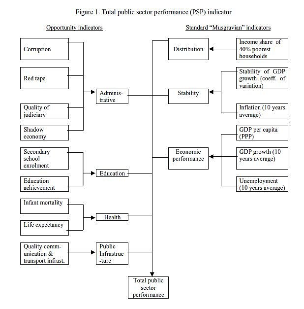
The objective of this paper is to provide a proxy for measuring public sector performance and efficiency. To do this we will put together a number of performance indicators in the government’s core functions. …We will set these indicators in relation to the costs of achieving them. We will, hence, derive simple performance and efficiency indicators for 1990 and 2000 for the public sectors of 23 industrialised OECD countries. …As a first step, we define 7 sub-indicators of public performance. The first four look at administrative, education, health, and public infrastructure outcomes. …The three other sub-indicators reflect the “Musgravian” tasks for government. These try to measure the outcomes of the interaction with and reactions to the market process by government. Income distribution is measured by the first of these indicators. An economic stability indicator illustrates the achievement of the stabilisation objective. The third indicator tries to assess allocative efficiency by economic performance.
Here’s a flowchart showing how they measured public sector performance.
I should explain, at this point, that I’m not a total fan of the PSP measure. Most of the indicators are fine, but some rub me the wrong way.
I think an even distribution of income is a nice theoretical concept, for instance, but I don’t think it can be mandated by government (unless the goal is to make everybody poor). Economic stability also isn’t necessarily a proper goal. I’d much rather live in a society that oscillates between 7 percent growth and ‑2 percent growth if the only other alternative was a society that had very stable 1 percent growth.
But enough nit-picking on my part. What did the study find when looking at public sector performance?
Indicators suggest notable but not extremely large differences in public sector performance across countries… Looking at country groups, small governments (industrialised countries with public spending below 40 percent of GDP in 2000) on balance report better economic performance than big governments (public spending above 50 percent of GDP) or medium sized governments (spending between 40 and 50 percent of GDP).
These are remarkable findings. Nations with small governments achieve better outcomes. And that’s including some indicators that I don’t even think are properly defined!
But what’s most amazing is that the above findings are simply based on an examination of outputs.
So what happens if we also look at inputs to gauge the degree to which governments are delivering a lot of bang for the buck?
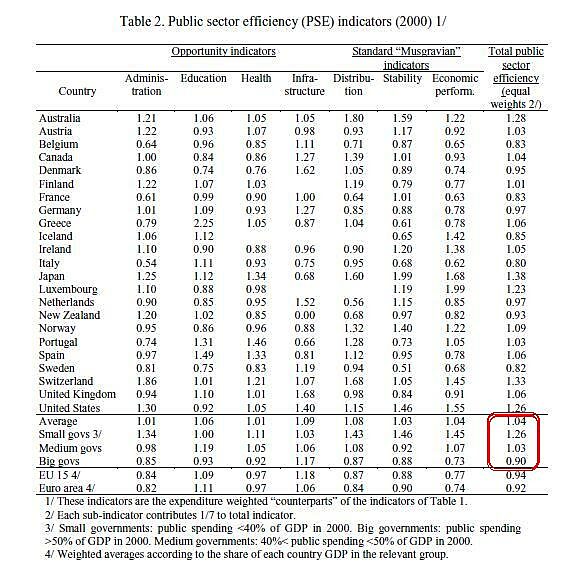
Public expenditure, expressed as a share of GDP, can be assumed to reflect the opportunity costs of achieving the public sector performance estimated in the previous section. …Public expenditures differ considerably across countries. Average total spending in the 1990s ranged from around 35 percent of GDP in the US to 64 percent of GDP in Sweden. The difference is mainly due to more or less extensive welfare programs. …we now compute indicators of Public Sector Efficiency (PSE). We weigh performance (as measured by the PSP indicators) by the amount of relevant public expenditure, PEX, that is used to achieve a given performance level.
And what did the experts discover? Just below is a chart showing the results. There’s a lot of data, particularly if you’re looking at individual countries. To see the bottom-line results, look at the numbers circled in red.
As you can see, countries with small governments are far more productive and efficient.
We find significant differences in public sector efficiency across countries. Japan, Switzerland, Australia, the United States and Luxembourg show the best values for overall efficiency. Looking at country groups, “small” governments post the highest efficiency amongst industrialised countries. Differences are considerable as “small” governments on average post a 40 percent higher scores than “big” governments. …This illustrates that the size of government may be too large in many industrialised countries, with declining marginal products being rather prevalent.
The conclusion of the study makes some very important observations.
Unsurprisingly, countries with small public sectors report the “best” economic performance… Countries with small public sectors report significantly higher PSE indicators than countries with medium-sized or big public sectors. All these findings suggest diminishing marginal products of higher public spending. …Spending in big governments could be, on average, about 35 per cent lower to attain the same public sector performance.
Though I can’t help but wonder what the results would have been if Hong Kong and Singapore also were added to the mix.
After all, I don’t consider the United States to have a “small” government. Same for Japan, Switzerland, and Australia. Those are simply nations where government isn’t as big and bloated as it is in France, Italy, Sweden, and Greece.
Imagine the results if you could measure public sector performance and public sector efficiency
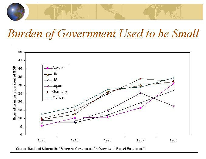
for the United States and other developed nations in the pre-World War I era, back when the burden of government spending averaged less than 10 percent of economic output.
I strongly suspect we got far more “bang for the buck” when government was genuinely small.
But I don’t want to make the perfect the enemy of the good, so let’s focus on the results of the study. The clear message is that big governments spend a lot more and deliver considerably less.
And that’s a very worrisome message since the burden of government is projected to increase substantially in the United States thanks to demographic changes and poorly designed entitlement programs.
So at the very least, we should do everything possible to reform those programs to keep America from becoming Greece.
And once we achieve that goal, then we can try to reduce the size and scope of government so we’re more like Hong Kong and Singapore, with only about 20 percent of GDP diverted to government.
Then, in my libertarian fantasy world, we can cut, prune, privatize, and eliminate until government once again only consumes about 10 percent of economic output.


