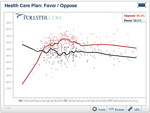
From time to time, I’ve posted Pollster.com’s trend estimate of all polls gauging public opinion on ObamaCare. It’s a great little tool. But recently, I noticed something.
The Kaiser Family Foundation’s monthly tracking poll not only finds the most support for ObamaCare, but it also gets disproportionate weight in the Pollster.com trend estimate, simply because KFF polls the public on ObamaCare more frequently than others. Since President Obama signed the law on March 23, 2010, KFF has polled this question more often than the next two most frequent polls combined. That makes the gap between opposition and support smaller than it would be if KFF conducted its poll as frequently as other groups conduct theirs (or vice versa).
To illustrate, here’s what the trend estimate looks like incorporating all polls. As of this month, opposition leads support by 7.3 percent (45.3 percent opposed to ObamaCare vs. 38 percent in favor).
Here’s what the same graph looks like when we exclude the KFF polls. The margin of opposition nearly doubles to 13.9 percent (49.9 percent opposed vs. 36 percent in favor).
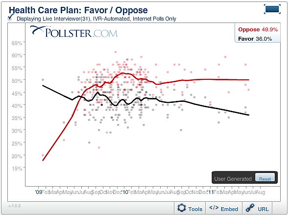
Of course, this graph gives the KFF poll zero weight, which is unfair. But it shows that if all polls received equal weight, opposition to ObamaCare could easily lead support by 10 percentage points or more.
