In the New York Times on Wednesday, David Leonhardt presented a chart under the headline “Amtrak Crash and America’s Declining Construction Spending.”
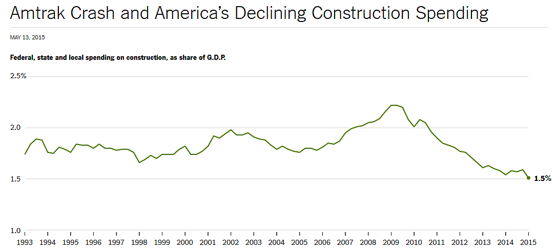
The chart shows federal, state, and local government construction spending as a share of GDP. Leonhardt discusses America’s “crumbling infrastructure,” particularly rails, bridges, highways, and airports. He highlights the spending decline as a share of gross domestic product over the past five years.
Leonhardt also cites Joe Weisenthal of Business Insider, who presented a similar chart after the collapse of a bridge near Seattle two years ago. Weisenthal’s brief piece was called “The Collapse Of Public Infrastructure Spending In One Chart.”
There is a big problem here: the falling spending that Leonhardt and Weisenthal point to has very little to do with transportation. The data come from the Census, which the two writers extracted from this Fed database. The data can be broken out into a dozen subcomponents for the period 2002–2015. If the writers had done that, they would have come to different conclusions.
The three largest subcomponents of government construction are highways and streets, education, and (non-road) transportation, which includes airports, seaports, and transit. Using the Fed database, I charted the three components in millions of dollars; that chart is below the jump. (I’ll look at spending as a percentage of GDP in a moment.)
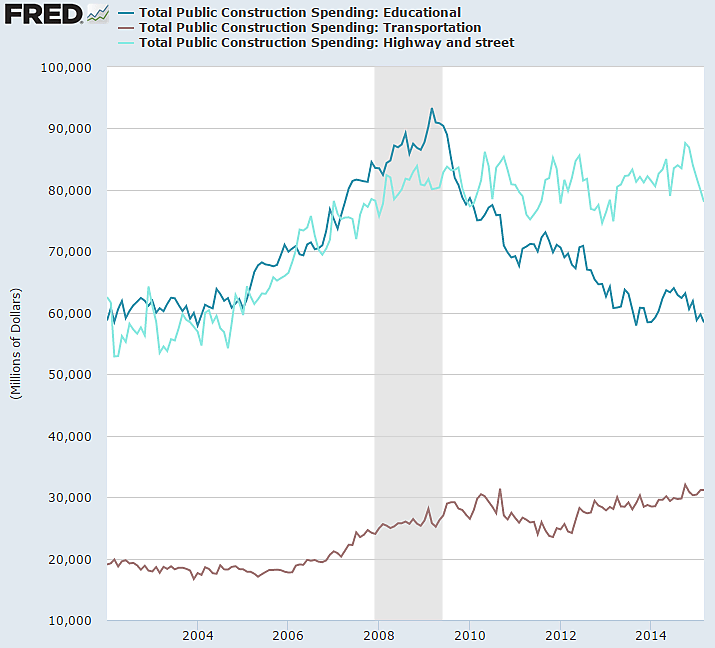
Government spending on highways and streets (light blue) and transportation (brown) have been roughly flat the past five years after surging the prior five years. It is spending on education (dark blue) that has plunged, and which has dragged down overall government construction spending. I don’t know why construction on schools and colleges soared and then plunged, but that is the main cause of the recent downward trend in public construction, not any form of transportation.
As a share of GDP, Leonhardt’s chart shows a drop in total infrastructure spending from 2.2 percent in 2009 to 1.5 percent in 2015. By my calculations, just 0.1 percentage point of that 0.7 percentage point drop came from any type of transportation spending. And note: that small drop came from what was an extraordinary peak in 2009. Plus, in dollar terms, transportation spending hasn’t declined at all.
In sum, the data underlying the charts presented by Leonhardt and Weisenthal do not support their themes of crumbing transportation infrastructure.
A further concern about such infrastructure articles is that they focus on spending levels, not spending quality or efficiency. The Soviet Union and other central-planning failures should have convinced everybody that spending quality is more important than spending levels. Leonhardt says that some of our airports look “dilapidated” compared to airports in Europe and Asia, but one reason is that American airports are all government-owned. By contrast, many airports abroad are now privately owned or managed.
I would agree with Leonhardt and Weisenthal that America faces infrastructure challenges. But we can meet those challenges by decentralizing funding and decisionmaking as much as possible, and to follow the lead of other advanced economies and privatize. For further reading on infrastructure reform, see here and here. For Amtrak, see here and here.
(Thanks to Veronique for pointing out the NYT article).
