The U.S. Department of Education has just released 2013 results for the National Assessment of Educational Progress—aka, “The Nation’s Report Card.” The scores are for 12th grade reading and mathematics, and neither has changed since the last time they were administered a few years ago. But of course what we really want to know is how well students are performing today compared to those of a generation or two ago. That would tell us if our education system were improving, staying the same, or declining in performance.
The trouble is, “The Nation’s Report Card” doesn’t go back very far. The reading results reach back to 1992 (since which time, there has been a slight but statistically significant decline), but the math results only reach back to 2005 (since which time, there’s been a slight but statistically significant increase). It’s just not that long of a time period to assess trends.
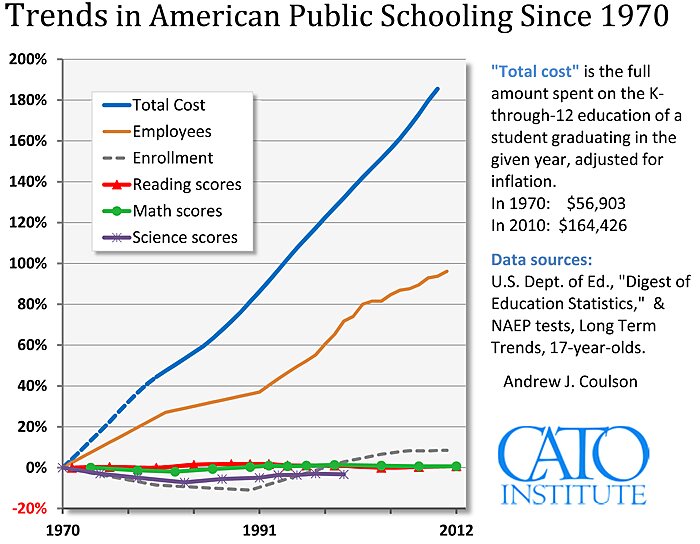
Wouldn’t it be great if there were a different set of NAEP tests, called the “Long Term Trends” series, that reached back all the way to the early 1970s! And wouldn’t it be even better if we could find out how much we’ve spent per pupil over that same time period, so that we could figure out if our schools are getting more or less efficient with our dollars? Well, what do you know, there is, and we can!
But here’s the thing. Some people look at that national trend chart and think: but my state is doing much better than that! Is it? Is it really? I decided to find out, for all fifty states. The result is my recent, mysteriously-titled paper: State Education Trends. Drop by and check out how your state has done over the past 40 years.
[Note to readers: The state charts look at changes in annual per pupil spending over time, whereas the national chart above looks at the change over time in the total cost of a full K‑through-12 education, so the spending trend lines are not directly comparable].
