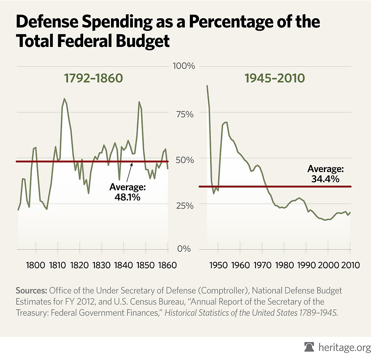
The Washington Examiner ran this Heritage Foundation chart on January 10 under the title (not online) “Defense spending at lowest levels in 60 years”:
Dramatic, eh? It shows defense spending plunging for the past 40 or more years. Except … wait a minute … has defense spending plunged? This chart from the Cato Institute’s Downsizing Government project sheds some light:
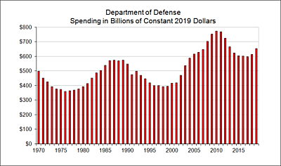
In fact, Pentagon spending in real, inflation-adjusted dollars has roughly doubled since 2000 and is up about 50 percent since 1970, at the height of the Vietnam War. (And note that the recent figures don’t include the cost of the ongoing wars.) So what’s going on? Why the difference in the charts? The Heritage chart, of course, focuses on Pentagon spending as a percentage of the federal budget. And what has happened to the federal budget in the past 40 years? Well, as it happens, another Heritage Foundation chart shows that pretty clearly:

Obviously, the big story in the federal budget over the past 40 years is the dramatic rise in spending on transfer payments. Does the Heritage Foundation really want to suggest that when spending on Social Security, Medicare, and Medicaid rises, military spending should rise commensurately? That when President Bush creates a trillion-dollar Medicare prescription drug entitlement, he should also add a trillion dollars to the Pentagon budget to keep “Defense Spending as a Percentage of the Federal Budget” at its previous level?
Cato and Heritage scholars have often differed on U.S. foreign policy and the defense budget that it implies. But surely neither group would actually suggest that U.S. national security should be measured by the relationship of military spending to entitlement spending. Surely we would agree that military spending must be sufficient to ensure U.S. security and not tied to some extraneous factor. So I invite the creators and promoters of the above chart to explain exactly what they think it proves.
By the way, Heritage’s Rob Bluey, in introducing this chart, writes, “The chart also debunks the myth that our Founding Fathers were isolationists.” But again context matters. I’ll leave the debate over foreign policy in the early Republic to another day. But if total federal spending in 1820 was $19.4 million, and 53 percent of it was for defense, what that tells us is that the federal government was wonderfully small in the early years of the Republic. I’m pretty sure that $10 million military budget didn’t pay for two wars, troops in 150 countries, or a million-man standing army.
