We’ve updated the charting tool at www.downsizinggovernment.org/charts with the latest data. You can plot spending on hundreds of federal agencies and programs in constant, or inflation-adjusted, dollars. The charts cover 1970 to 2016.
Which are the largest federal government agencies, and how much have they grown? The following series of seven charts captured from the charting tool shows the 21 largest agencies in order by size.
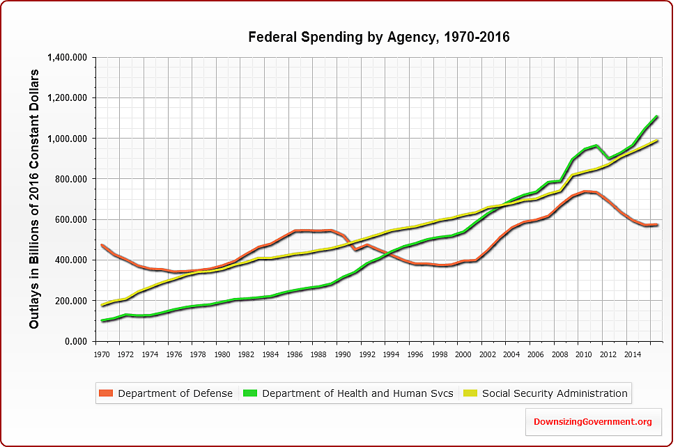
The first chart shows that Defense, Health and Human Services, and the Social Security Administration used to vie for top spot as the largest agency. But Defense is now being left in the dust, as the latter two entitlement-dispensing agencies gobble up ever more tax dollars.
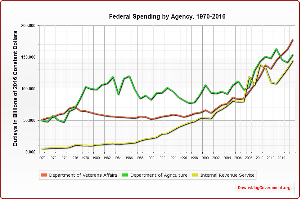
The second chart shows that Veterans Affairs, Agriculture, and the IRS have soared in cost over the past decade. And, remember, these charts are in constant dollars. The bulk of Agriculture’s budget is the food stamp program, which should be put on the chopping block. IRS spending has soared due to the cost of “refundable” tax credits, such as the earned income tax credit.
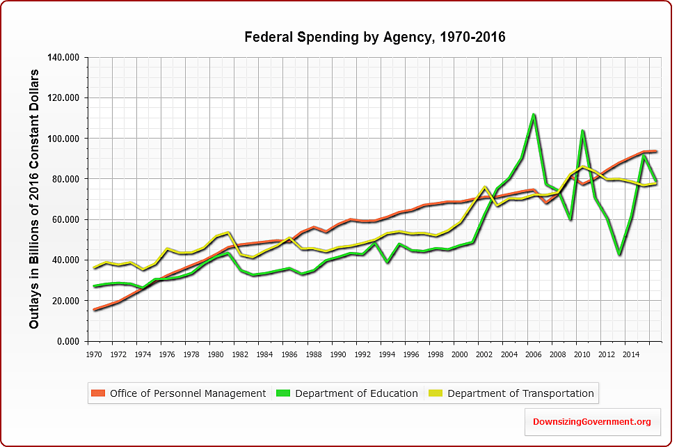
The third chart shows Education, Transportation, and the Office of Personnel Management. The latter agency includes retirement and health care programs for federal workers. The Education budget gyrates widely because of recalculations in the costs of student loans. The line for Transportation shows a solid upward trend, despite all the whining we hear about the shortchanging of infrastructure. Anyway, the proper amount of federal Transportation spending ought to be near zero, for reasons I discuss here.
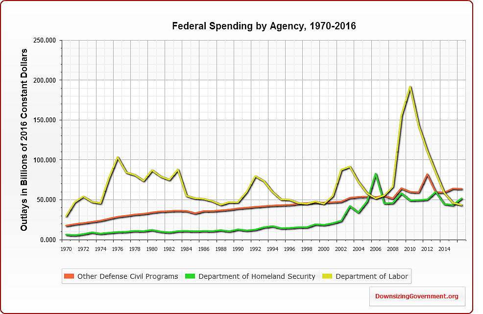
The fourth chart shows Labor, Homeland Security, and Other Defense Civil Programs. The latter includes spending on military retirement and health care. The spike in Labor was due to the extra long UI benefits passed by Congress during the recession. Homeland spending spiked during the Bush years and remains high.
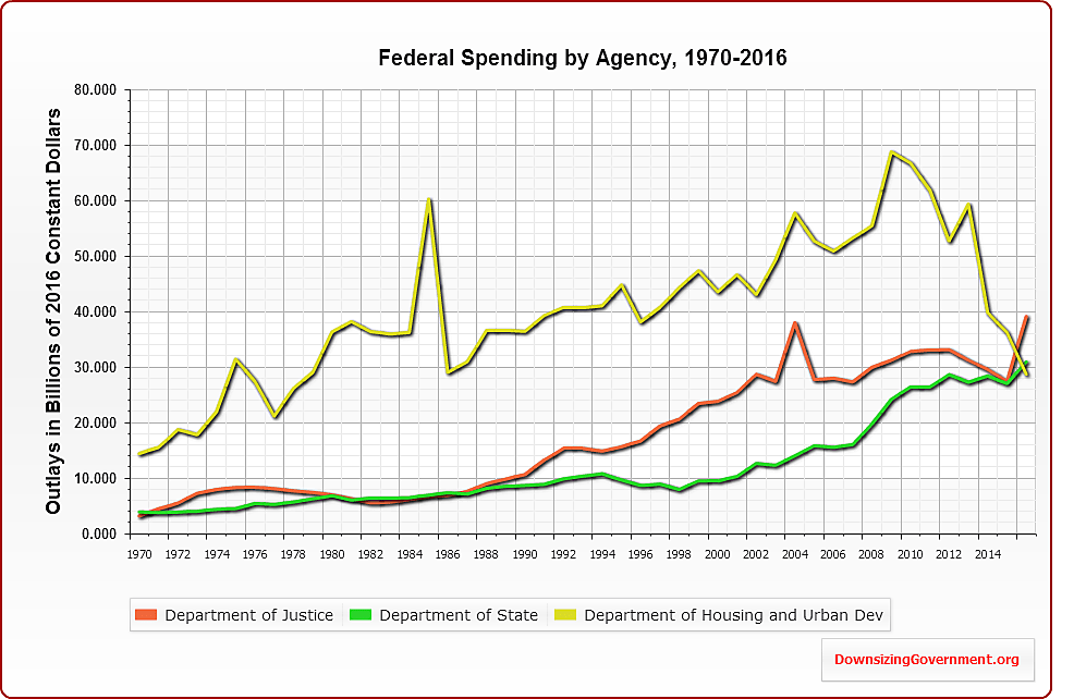
The fifth chart shows that State department spending has soared under Obama. It also shows a large drop in HUD spending, and that relates to the way that the budget accounts for housing finance subsidies. HUD subsidies for rental aid and community development remain at high levels.
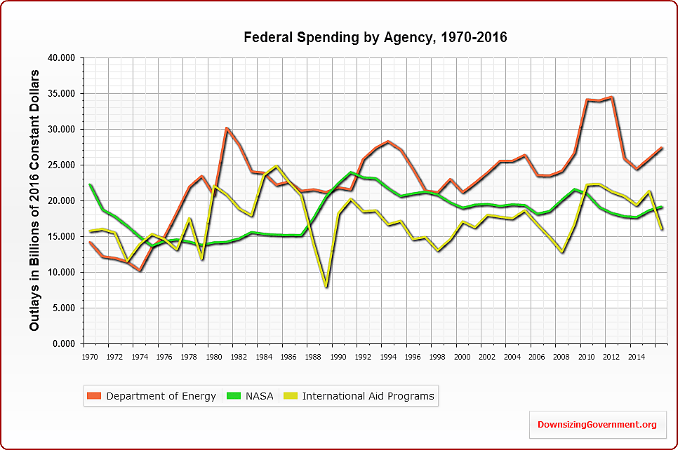
The sixth chart shows Energy, NASA, and International Aid. The recent Energy spike stems from the “stimulus” package passed in 2009.
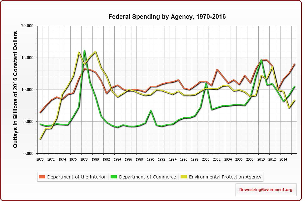
The seventh and final chart, below, shows Interior, Commerce, and the EPA. The spikes in Commerce surround Census years. You can see this clearly if you go to www.downsizinggovernment.org/charts, click open Commerce, and plot Census separately.
Similarly, use the chart tool to see that the Commerce spike in the late 1970s was for the Economic Development Administration, which by the way is one of the dumbest agencies in the government. Finally, if you click open EPA on the charting tool, you can see that the spike in the late 1970s was due to a surge in grants to state governments.
Which of all these departments and agencies should be cut? I’d suggest starting with these.