As I blogged earlier, yesterday the Kaiser Family Foundation and the Health Research & Educational Trust released their survey of employer-sponsored health benefits in 2010.
For most of this survey’s history, it included a very useful graph of the average growth rate of employer-sponsored insurance premiums. Here’s the graph from their 2007 survey:
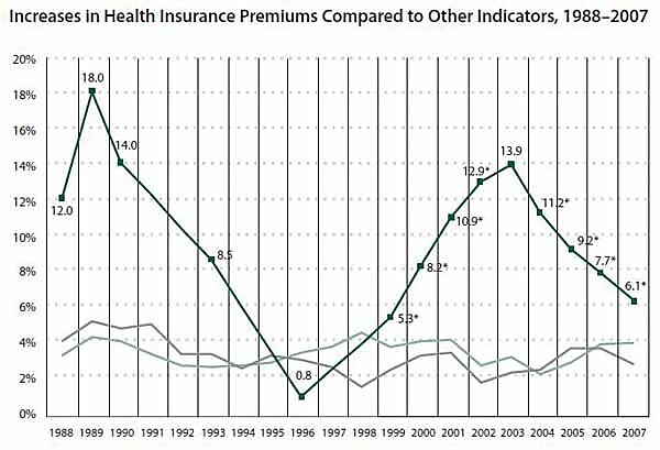
(The grey and light-green lines represent year-to-year growth in overall inflation and wages, respectively.)
Unfortunately, 2007 was the last year that KFF/HRET included that graph in their annual survey. Had they included that graph this year, it would have shown an even more heartening moderation of premium growth:
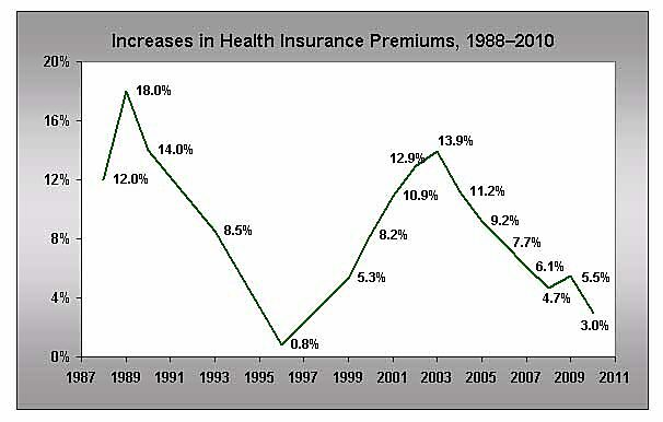
A lot of things can drive premium growth. I discussed a couple of them in my last post. Some factors that could cause premium growth to moderate might not be all that welcome; if insurers dumped all their sick enrollees, for example. But absent dramatic evidence of that, isn’t this good news? And isn’t good news worth highlighting?
