Many critics of immigration claim that immigrants will grow the size of government. As their argument goes, allowing for more lawful immigration to the United States will produce a larger government through immigrant voting behavior or their children’s voting behavior. However, if another factor like institutional changes can explain the growth of government, we would expect government to grow independently of the size of the immigrant stock.
There are many measures of the size of government, many of which are included in the Economic Freedom of the World: 2014 Annual Report. As excellent as that report is, the data does not go back far enough to show whether government growth a century ago tracks well with growth in the immigrant population. Older data is essential because there have been radical changes in immigration policy over the last century and larger changes in the growth of government. By looking at the more distant past, a clearer picture can be formed over how immigration has impacted growth in government – if at all. My charts below focus on the federal government only.
Below I use two measures of the growth of the federal government from 1901–2010: Real outlays (2010 dollars) per capita and government outlays as a percent of GDP. I use figures for every decade as yearly data is more difficult to attain.
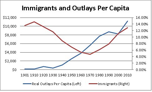
Source: Table 1.1, http://www.whitehouse.gov/omb/budget/historicals & U.S. Census
Real government outlays per capita go up no matter what happens to the stock of immigrants. Two forty-year periods had very different immigration policies: 1930 to 1970 and 1970 to 2010.
From 1930 to 1970, when permanent immigration to the U.S. was heavily restricted, real outlays per capita grew about 17 fold. From 1970 to 2010, when the percent of immigrants increased from its lowest point in American history (4.7 percent to almost 13 percent), outlays per capita grew by two-fold. That is a large increase but nowhere near the growth that occurred during the period when immigration was heavily restricted.
Looking at the 1901–1930 period, a time when immigration was less restricted, real outlays per capita grew by 1.9 fold – almost the same growth rate as the relatively liberalized 1970–2010 period. Government grew the quickest in the time period when immigration was heavily restricted. The relatively more open immigration policies before and after the 1930–1970 period coincided with slower growth in the size of real government outlays per capita.
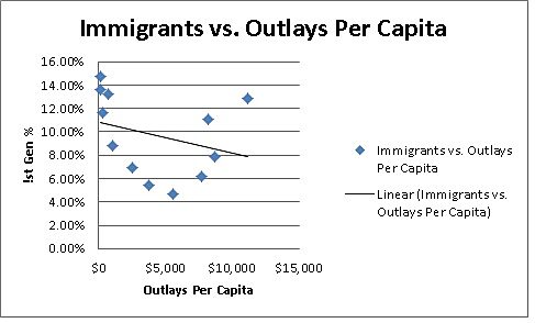
Sources: Table 1.1, http://www.whitehouse.gov/omb/budget/historicals & U.S. Census
For the 1901–2010 data, the correlation coefficient here is ‑0.298 – meaning that as either outlays or the stock of immigrants increases, the other decreases. This does not support the thesis that a greater stock of immigrants is correlated with bigger government.
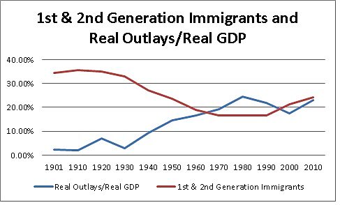
Perhaps the immigrants themselves are not the only culprits responsible for an increase in government. Perhaps their American born children are also responsible.
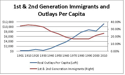
Sources: Table 1.1, http://www.whitehouse.gov/omb/budget/historicals & U.S. Census
Sources: Table 1.1, http://www.whitehouse.gov/omb/budget/historicals & U.S. Census
From 1901 to 2010, the stock of immigrants and their children is even more negatively correlated with real outlays per capita. The correlation coefficient here is ‑0.748. The correlation between the stock of immigrants and their children and government outlays is negative – the opposite of what critics of immigration contend.
Perhaps my previous graphs, which measured real outlays per capita, were the wrong way to measure the size of government. Below I measure the growth of government by looking at outlays as a percent of GDP.
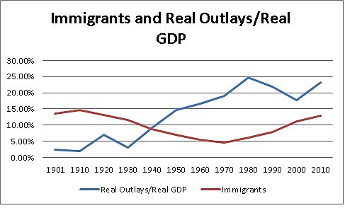
Sources: Table 1.1, http://www.whitehouse.gov/omb/budget/historicals & U.S. Census
Sources: Table 1.1, http://www.whitehouse.gov/omb/budget/historicals & U.S. Census
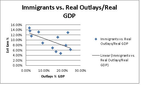
The relationship between immigration and the size of federal outlays is even more negative than the per-capita data. The correlation coefficient here is ‑0.624. As federal outlays as a percentage of GDP increase, the share of the foreign born population falls. Again, this is just a correlation and I am not implying causation.
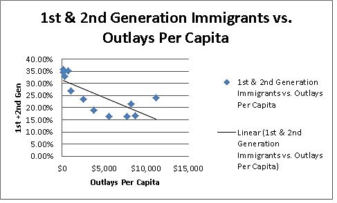
What about including the size of the immigrant population and their children with outlays as a percent of GDP? I get the most negative results yet.
Sources: Table 1.1, http://www.whitehouse.gov/omb/budget/historicals & U.S. Census
Sources: Table 1.1, http://www.whitehouse.gov/omb/budget/historicals & U.S. Census
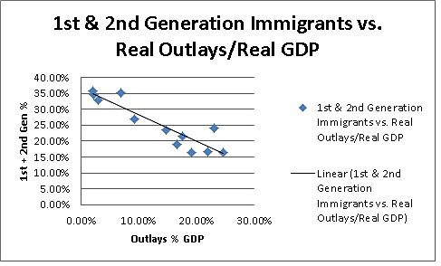
The relationship between the stock of immigrants plus their children and the size of federal outlays is my most negative finding. The correlation coefficient here is ‑0.914. As federal outlays as a percentage of GDP increase, the share of the population that is foreign born plus their children falls.
Looking at the 1901–1930 period, a time when immigration was less restricted, government outlays as a percent of GDP grew by 1.3 fold. During the 1930–1970 period of heavy immigration restrictions, federal outlays as a percent of GDP grew increased by 6.3 fold. During the 1970–2010 period of less restricted immigration, government outlays as a percent of GDP grew 1.2 fold. Government outlays as a percent of GDP grew most rapidly during the time period when immigration was most restricted.
To be clear, these are merely correlations and I am not arguing that more immigration results in a smaller government. It could be that smaller government attracts more immigrants or there could no causal relationship here. I am merely showing that the persistent claims of immigrants causing an increase in the size of government do not match the facts.
