When Thomas Piketty and Emmanuel Saez release their annual estimates of top 1 percent incomes, you can count on The New York Times to put it in a front page headline with additional hype on the editorial page. This time, however, the news was that the top 1 percent had suffered a 14.9 percent decline in real income in 2013 if capital gains are included, as they always had been until now.
The New York Times heroic spin was “The Gains From the Economic Recovery Are Still Limited to the Top One Percent.” The author, Justin Wolfers of the Peterson Institute wrote, “Emmanuel Saez … has just released preliminary estimates for 2013. The share of total income (excluding capital gains) going to the top 1 percent remains above one sixth, at 17.5 percent. By this measure, the concentration of income among the richest Americans remains at levels last seen nearly a century ago.”
I will have more to say about this in another blog post. For now, I just want to call attention to the artistic way in which the subject was changed. Since 2008, Saez has been comparing changes in top incomes (for which he has preliminary IRS data) to incomes of the bottom 90 percent (for which IRS data are singularly inappropriate). He always included realized capital gains because that makes the top 1 percent share both larger and more cyclical.
Those share-of-gains calculations were the source of the politically popular canard that the top 1 percent had “captured” 91 percent of the gains in total income since 2009 which, as Scott Winship noted, drops to 30 percent if we include 2013. Saez now prefers to say the top 1 percent captured 106 percent of the 2013 decline, leaving the previous 91 percent absurdity intact.
President Obama raised tax rates on top income and capital gains in 2013, and the immediate result was big drop in the amount of such income reported by the top 1 percent — just as I and others had predicted. Saez asks us to take mercy by averaging 2012 and 2013, which comes out to $1,217,002. That is down quite a lot from $1,533,064 in 2007, but we aren’t supposed to mention cyclical downturns, only the upturns.
Wolfers asks us to be even more merciful and leave out capital gains this time. That doesn’t help much, but it allows him to fog recent events by talking about “nearly a century ago.” This echoes the familiar comparison that Senator Ted Cruz and Pew Research made between 1928–29 the now disavowed top 1 percent share in 2012.
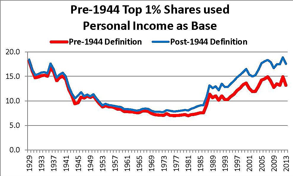
But the Piketty and Saez estimates for 1928 or 1929, and all other years up to 1944, calculate shares by comparing top incomes with personal income from the GDP data. They define total income as personal income less 20 percent until 1944, and then switch to a modified version of Adjusted Gross Income after that (missing 40 percent of personal income in the process). They also subtract Social Security and unemployment benefits from the denominator of the top 1 percent ratio, which has zero effect in 1929 but greatly exaggerated top income shares in recent years.
The blue line in the graph shows the same data in Wolfers’ graph. The red line shows what the data would look like if top income shares today were defined the same way they were in 1929. Note the huge increase at the time of the 1986 Tax Reform, when the top 1 percent share of income reported on individual tax returns (rather than being unreported or reported on corporate tax returns) shot up from 7.6 percent to 11.4 percent. These pre-tax pre-transfer data tell us much more about changing tax rates, than they do about income distribution.
When measured a comparable basis, the top 1 percent earned 18.4 percent of income in 1929 and 13.3 percent in 2013. Using the same measure of total income shows the comparison between top income shares in 2013 and 1929 is false.

