Global Science Report is a weekly feature from the Center for the Study of Science, where we highlight one or two important new items in the scientific literature or the popular media. For broader and more technical perspectives, consult our monthly “Current Wisdom.”
Is it hot enough for you?
You don’t know, and neither do global warming policy wonks.
Climatologically speaking, temperatures peak in the second half of July, especially here in the East. Thanks to this, global warming horror stories also max out, followed by the usual pleadings for this or that regulation of dreaded carbon dioxide. The latest greatest rage in a direct tax on carbon dioxide emissions, which will no doubt be trotted out in this week’s eastern heat.
But how hot is it? We know what the thermometer reads, but how does that compare to past thermometer readings?
It turns out there are several factors that confound temperature histories—some obvious, some subtle, and no doubt an unknown number of things that are simply missed.
An obvious one is that bricks, buildings and pavement increasingly “urbanize” the climate, retaining the heat built up during the day and impeding cross ventilation from the local wind regime. To compensate, most long-term temperature histories adjust urban temperatures in comparison to neighboring stations.
A more subtle one is that a systematic change in the time of day in which the high and low temperatures are read (and reset) is also important. As an example, consider a station in which the observer records the previous 24-hour high and low temperatures at 5pm, local time. That’s near the time of day, in the summer, when temperatures are around their daily high. If the day is really hot, say, 100° or so, the temperature at 5:01 is likely to be the same, meaning there are two very hot days recorded when there may have only been one if temperatures were reset at midnight.
There are plenty of other adjustments made to local temperature histories such as accounting for movement of weather stations, changes to the local environment, and adjustments for technological changes, such as switching from mercury-in-glass to electronic thermometers.
And there are some factors that are completely ignored and unaccounted for, having to do with economic factors. Near-neighbor comparisons aren’t going to do a bit of good if an entire country (say, Chad) is too poor to spend anything maintaining weather stations. The fact is that as they “weather,” unattended stations get darker, which means that the temperature gets hotter.
More on this later.
Consider the Department of Commerce’s US Historical Climate Network (USHCN) for the lower 48 states.
Here’s the raw data (Figure 1), courtesy of Steve Goddard at Real Science (as opposed to the reliably alarmist site “RealClimate”).
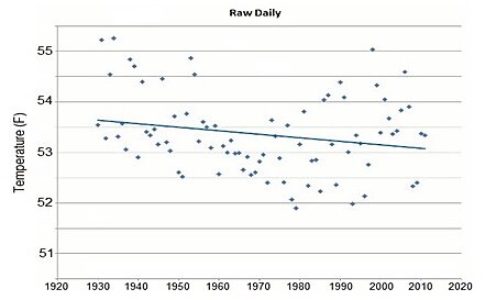
Figure 1. Unadjusted temperature history of the United States (figure from Real Science).
Accounting for changes in the time of observation induces a slight warming trend of a couple of tenths of a degree per century since 1930—but that’s nowhere near the shocking change that results from additional adjustments (Figure 2):
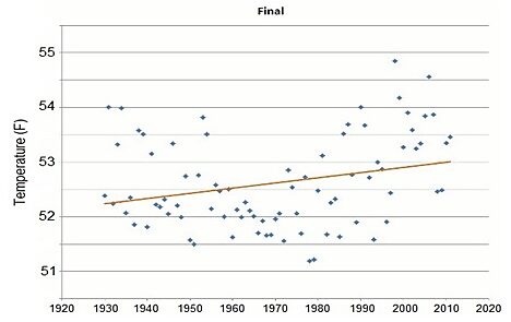
Figure 2. Adjusted temperature history of the United States (figure from Real Science).
Here’s the difference between the raw and the adjusted data over the entire period of record, which begins in 1895 (Figure 3):
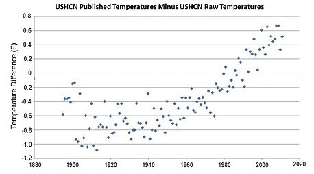
Figure 3. Difference between the adjusted and the raw temperature history of the United States (figure from Real Science).
The magnitude of the post-1950 warming induced by data adjustment is in fact equal to over half of the total warming.
What about the effects that aren’t accounted for? A few years back, Guelph University economist Ross McKitrick and yours truly (PJM) calculated the “non climatic” signal in long term temperature histories. Here’s a map of the difference between temperatures adjusted for those factors and what has been reported (Figure 4).
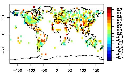
Figure 4. Difference bewteen observed and adjusted trends around the world. Positive values mean the observed trends are greater than the trends adjusted to remove non-climatic influences (figure from McKitrick and Michaels, 2007).
One thing that jumps out is that U.S. temperature records are pretty devoid of much systematic bias (greenish colors are a change of near zero). Another is that really poor places—like much of Africa and rural South America don’t have a lot of high-quality data (reflected by the large expanses of white). What stations they do have are probably not subject to a lot of upkeep such as being painted or washed, making them systematically hotter than they actually are. Current analysis methods involving a comparison to neighboring stations aren’t going to uncover this bias that appears pervasive over large continental regions.
This is one example of a systematic bias that induces artificial warming. And the reality is that we don’t know—obviously—what other factors we don’t know about!
It is doubtful that people pushing the latest fad, such as a carbon tax, have any clue the degree to which global warming is being manufactured (rightly or wrongly) by systematic adjustments to weather data, or how much it is being exaggerated by still unaccounted biases. In climate, policy wonks are rushing in where they should fear to tread.
Reference:
McKitrick, R. R., and P. J. Michaels, 2007. Quantifying the influence of anthropogenic surface processes and inhomogeneities on gridded global climate data. Journal of Geophysical Research, 112, D24S09, doi:10.1029/2007JD008465.
