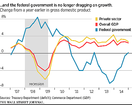
A Wall Street Journal story today looks at government spending through the lens of the national income and product accounts (NIPA). The article says that as government spending rises, it is “no longer dragging on growth.” Unlike recent years when spending was supposedly cut, the government today “has ceased to be a drag on growth.” But that is an unwarranted conclusion from the NIPA data, which are produced by the Bureau of Economic Analysis (BEA).
The BEA includes government output within overall gross domestic product (GDP). The first thing to note is that measuring government output is guesswork because most of it is not sold in the marketplace. The BEA solution “is to value government output in terms of the input costs incurred in production.” So if the government hires a worker for $80,000 to administer food stamps or impose new regulations, government “output” would rise by $80,000. That seems rather optimistic.
More importantly, NIPA data does not tell us the overall effect of government spending on growth. Let’s say defense spending rises $10 billion from added weapons purchases. NIPA would show government output rising $10 billion. The Wall Street Journal would have you believe that overall GDP would rise as well, but that ignores the effect of the spending on private output. Higher defense spending ultimately requires higher taxes, which are resources sucked out of the private sector. Also, Pentagon contractors would hire engineers and other skilled workers to produce the new weapons, drawing those people away from private goods production. As government output rose, the output of private goods would fall.
In the long run, private GDP would probably shrink more than $10 billion, and thus overall GDP would also shrink. One reason is that extracting taxes to fund federal spending generates “deadweight losses” as people reduced their working, investing, and other productive efforts. Another reason is that added government output is likely to be worth less than the private output replaced. That’s because government spending decisions are based on guesswork, whereas private spending decisions are guided by the price system, which helps direct resources to the highest-value uses.
So in the Wall Street Journal chart reproduced here, the reporter implies that when the blue line (government output) rises, the red line (overall output) is pushed upwards. But that ignores the negative relationship between the blue line and the yellow line (private output). The reality is that as the blue line rises, the yellow line would be dragged down, and that in turn would tend to drag down the red line over time.
For more on measuring the government in GDP, see here.
