Today, I’m at the House Administration Committee’s Legislative Data and Transparency Conference. It’s become the annual confab for learning what the House is doing to improve transparency, for learning what the Senate is not doing to improve transparency, and to mix and mingle with others working on opening Congress’s deliberations to digital access.
In our 2012 study, Grading the Government’s Data Publication Practices, we issued letter grades reflecting the quality of data the government makes available about its own deliberations, managment, and results, covering legislative process and budgeting, appropriating, and spending. The grading was based on criteria set out in an earlier study, Publication Practices for Transparent Government.

Grades are a way of showing the public, opinion leaders, and legislators what’s going on. For most areas, the grading study showed that access to data is relatively poor.
There is no question that people are working hard on things, and the House has consistently put in the most effort over the last few years. (The recently passed DATA Act now requires the administration to make an effort. Oversight and badgering will help ensure that it does.)
My contribution this year is a brief talk in which I’ll present what’s happening with data another way: by presenting a visualization of what’s happening with data flows—pictures!

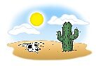
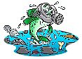
Water is a good metaphor for data. Ideally, data would emerge at the source, like a spring, drinkable and ready for use. But very often, key information about government is not available as data at all. People have to pump it out of the ground, turning paper or PDF documents into usable data. Sometimes data isn’t in a format that’s truly useful. It’s undrinkable or “polluted.”
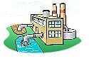
A lot of people in a lot of places are working to take data that is not ready for use and make it available. Our own contribution at Cato is the Deepbills project, which adds data to bills that allows computers to more readily access their meaning. Like a little water treatment plant. It’s not the only one.
It’s a big file (5.6 MB), but if you want, you can look through the PowerPoint. (Ignore the “Soup to Nuts” page—that’s a funny, funny joke, in my opinion, aimed at those who attended last year.)
