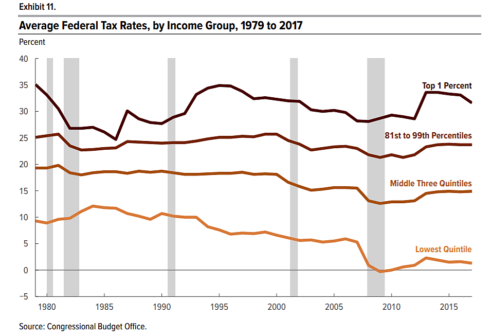
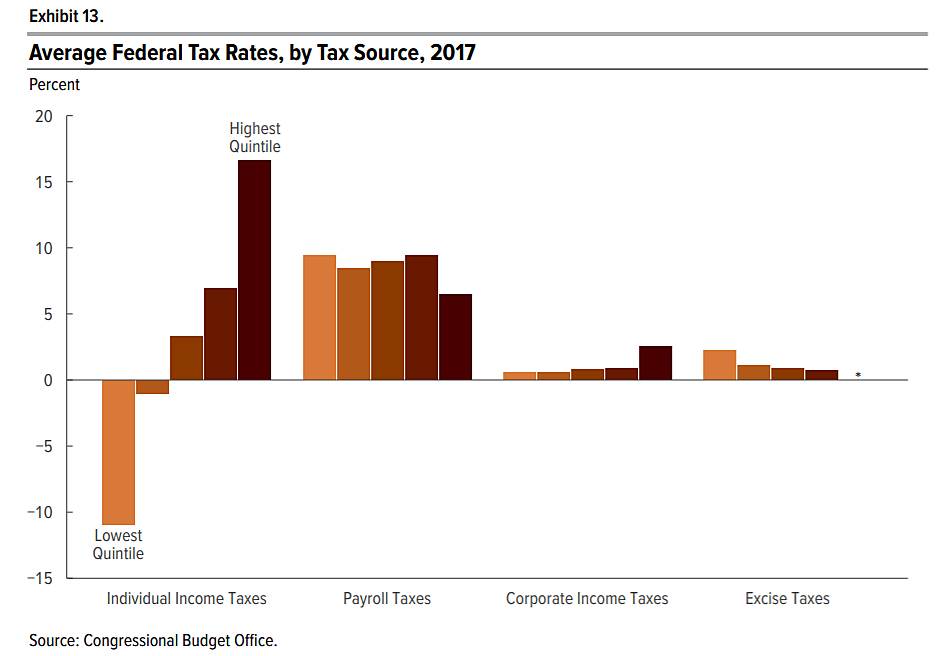
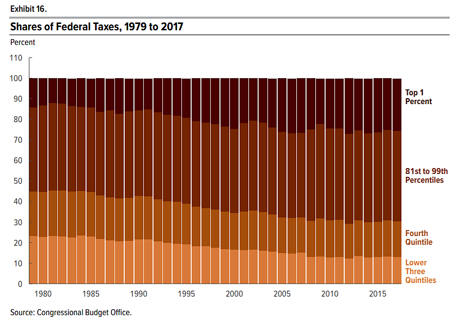
The Congressional Budget Office released a report today on changes in income, benefit payments, and federal taxes by income group since 1979. The following are three tax charts from the report. The CBO included individual income taxes, corporate income taxes, payroll taxes, and excise taxes.
The first chart shows that tax rates have fallen the most at the bottom end. Average tax rates are total taxes paid by each income group divided by that group’s income as defined by CBO. CBO says, “Average federal tax rates declined most sharply among households in the lowest quintile, falling from a peak of 12.1 percent in 1984 to 1.3 percent in 2017.” The tax rate on the top 1 percent has varied, but by 2017 was roughly where it was almost 40 years earlier. Since then, the 2017 GOP tax bill cut income taxes for all groups.
The second chart shows that individual income taxes are highly skewed. Payroll taxes are proportional across the bottom and middle groups but drop at the top end. Note, however, that payroll taxes fund Social Security, and that program’s benefits are calculated in a progressive manner.
The third chart shows that the share of overall federal taxes paid by high earners has increased over time. CBO says, “The share of federal taxes paid by households in the highest quintile increased from 55 percent in 1979 to 69 percent in 2017.” The share of taxes paid by the top 1 percent increased from 14 percent in 1979 to 25 percent in 2017.


