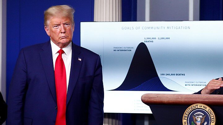
In the April 16 White House briefing, President Trump again said, as he often has before, that “models predicted between 1.5 and 2.2 million deaths” if we had not endured the various economic shutdowns imposed by the Governors of 42 States. The severity and breadth of those statewide shutdowns was initially encouraged, and is now justified, by just one dramatic statistic. That number was the 2.2 million U.S. deaths supposedly at risk from COVID-19.
The famed 2.2 million estimate first reached viral status in the March 31 White House briefing by Doctors Anthony Fauci and Deborah Birx. They displayed a graph with two bell-shaped epidemic curves placed on top of each other. Both curves estimate deaths per day which rise to a peak and then fall.
The steeper of the two curves was painted black and marked “Pandemic Outbreak: No Interventions.” It showed an estimated total of 1.5 to 2.2 million deaths from COVID-19 in what appears to be a relatively short period. The White House graph showed no dates, but the source of that now-famous 2.2 million estimate (as explained later) predicted U.S. deaths would keep rising until June 20.
The second “flattened” curve rises more slowly but also peaks later (in, say, August) with a more prolonged period of deaths than the steep curve (where more deaths happen more quickly). The flatter curve is labeled “With Interventions” and also100,000 to 240,000 deaths. Contrary to the delayed timing shown in the lighter graph, the architects of that more-delayed or flattened curve believe COVID-19 deaths have already peaked.
Based on the two curves, President Trump repeatedly remarked that State government mitigation plans saved two million lives – the difference between one curve’s estimate of 2.2 million and the other’s very different estimate of roughly 200,000. The graphs certainly do create that impression, although White House briefings by Fauci and Birx never spelled it out. They instead emphasized that the goal of “flattening the curve” was merely to buy time and avoiding overwhelming the hospitals, saving some lives (but not two million) by not running out of hospital beds and ventilators.
Where did the two curves come from? At first, many thought the estimates came from the White House experts. CNBC reported, “Dr. Birx said the projections by Dr. Anthony Fauci that U.S. deaths could range from 1.6 million to 2.2 million deaths is a worst-case scenario if the country did ‘nothing’ to contain the outbreak, but said even ‘if we do things almost perfectly,’ she still predicts up to 200,000 U.S. deaths.”
The steep curve with 2.2 million deaths was not from Dr. Fauci, however, but from Neal Ferguson’s team at Imperial College London. As for the flatter curve, Dr. Birx later attributed it to Chris Murray’s team at the University of Washington Institute for Health Metrics and Evaluation (IHME). However, even the highest IHME death estimates never approached 200,000 (unlike death estimates on that graph) and their mid-range estimates have lately been reduced from 93,000 to 69,000. Like the Imperial College model and others, the IHME model greatly overestimated the need for hospital beds and ventilators. But because it incorporates new facts, such errors get corrected.
The March 16 Imperial College paper, unlike the IHME model, is a month old and cannot be undone without losing face. Even with “the most effective mitigation strategy examined,” that study predicted, “the surge limits for both general ward and ICU beds would be exceeded by at least 8‑fold under the more optimistic scenario.” Yet there are no signs the U.S. will ever need 8 times as many hospital beds, or that even New York City is critically short of beds or urgent care facilities.
If the point of comparing two graphs was to show estimated deaths with and without “interventions,” then there was no reason to use two models rather than one. The same Imperial College model that warned of 2.2 million U.S. deaths with no interventions also predicted 1.1 to 1.2 million deaths –not 100,000 to 240,000– even with “the most effective mitigation strategy.” The Imperial College recommendations for “most effective mitigation” focused on social distancing for those over 70 and isolation of only those infected and their contacts, rather than banning jobs or closing all restaurants and beaches. An effective strategy would be targeted and localized, consistent with the new federal guidelines for gradually easing restrictions on the least-risky counties, populations, activities and businesses.
For the White House science team to meld the Ferguson and Murray curves into a single graph was quite inappropriate, because they are quite different. The Murray/IHME model continually monitors actual data on state and national deaths and hospitalization, and adjusts the projected epidemic curve to incorporate new information.
The Ferguson/Imperial College estimates, by contrast, came from a month-old (March 16) simulation model for high-density areas which constructed hypothetical scenarios using inflexible parameters about infection rates and other variables culled from obsolete studies of the earliest phase of the outbreak in Wuhan, China. In my next blog, I will attempt to explain how and why the Imperial College report may have ended up with such extreme projections of hospital bed shortages and deaths.
Dr. Fauci and Dr. Birx have done an outstanding job of explaining how the new coronavirus spreads and what we can all do to reduce the risk of getting infected or infecting others. Federal advice about proper handwashing and alcohol-based hand sanitizers, and (belatedly) the value of masks, helped reinforce the natural incentive of people to protect themselves. Federal bans on travel from China and Europe clearly saved lives. Many of the broad statewide mitigation mandates, though not yet efficiently targeted, nonetheless saved lives.
But it was disingenuous for the White House team to imply–by wrongly comparing epidemic curves from two different models–that these mitigation strategies may have saved two million American lives. The British model that once postulated a scenario in which 2.2 million U.S. lives could be at risk was simply wrong, and references to it should stop.

