COVID-19 statistics that are easiest for reporters to find and explain are often the ones we keep hearing about in daily news reports. A perennial favorite is the John Hopkins University graphical database which is constantly updated to add up the cumulative number of “confirmed” cases, deaths and recoveries since January 21 for separate countries and the world.
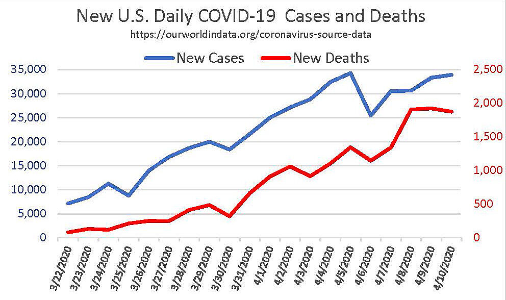
To switch the focus from these familiar multi-month totals to what is happening now, however, I built this simple graph of daily new deaths and daily new confirmed cases. It does suggest recent flattening, though professional optimism about reaching a peak is partly based on key states rather than national totals.
The cumulative data we see repeatedly in the daily news is not always the data we need. “Confirmed cases” in the John Hopkins data means cases that were tested. This makes it sensitive to the intensity of testing and also limits the count to those sick enough to be tested. It also exaggerates the apparent death rate by excluding the majority of COVID-19 infections, those having mild or no symptoms.
The “number recovered” would ultimately add up to 99% of infections if 1% died. Yet the number recovered seen in the John Hopkins site always remains very low. That is because states don’t keep track of what happened to every sick person, and nobody knows about the vast majority who recover at home.
As these cumulative multi-month totals go, the most relevant one is missing. That would be “active” cases – all those infected minus those who recovered or died. But the published numbers don’t tell us how many Americans are now or ever have been infected, nor how many recovered. Compared with confirmed cases and recovered cases, death numbers are more meaningful and solid (despite ambiguity about attributing death to COVID-19 despite underlying conditions).
Cumulative totals include old history. The numbers we need would tell us whether or not the rate of change is slowing for new deaths. New deaths are a good proxy for new cases (as the graph shows), and also for new hospitalizations with a lag. But death figures are clearer and easier to track.
The Murray Model I discussed on April 6 updates a model-built epidemic curve with actual daily deaths by state. It has already reduced mid-range estimates COVID-19 total deaths from about 81,000 to 61,000. But the model’s highest estimates more than double that figure, and even the mid-range curve (which fits best so far) can rise or fall with new data. The main point is that I do believe the model’s focus on real-time death data is the best single indicator we have right now or will have later without a lot more testing, including random samples and testing for immunity.
