Global Science Report is a feature from the Center for the Study of Science, where we highlight one or two important new items in the scientific literature or the popular media. For broader and more technical perspectives, consult our monthly “Current Wisdom.”
A few weeks have now passed since the end of last year, giving enough time for various data-compiling (and “data-adusting”) agencies to get their numbers in order and to release the sad figures from 2013.
U.S. Annual Average Temperature
We pointed out, back in this post in mid-December, that there was an outside chance—if December were cold enough—that the average annual temperature for the U.S. in 2013 would fall below the 20th century average for the first time since 1996. Well, despite how cold it seemed in December, it turned out to not quite be cold enough to push the January-December 2013 temperature anomaly into negative territory. Figure 1 below shows the U.S. temperature history as compiled by the National Climatic Data Center from 1895 through 2013.
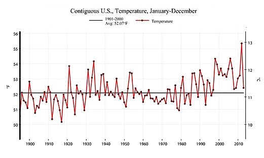
Figure 1. U.S. annual average temperature as compiled by the National Climatic Data Center, 1895–2013 (data: NCDC Climate at a Glance).
Please be advised that this history has been repeatedly “revised” to either make temperatures colder in the earlier years or warmer at the end. Not one “adjustment” has the opposite effect, a clear contravention of logic and probability. While the US has gotten slightly warmer in recent decades, compared to the early 20th century, so have the data themselves. It’s a fact that if you just take all the thousands of fairly evenly-spaced “official” weather stations around the country and average them up since 1895, that you won’t get much of a warming trend at all. Consequently a major and ongoing federal effort has been to try and cram these numbers into the box imposed by the theory that gives the government the most power—i.e., strong global warming.
What immediately stands out in 2013 is how exceptional the average temperature in 2012 (the warmest year in the record) really was. In fact, the recovery in 2013 from the lofty heights in 2012 was the largest year-over-year temperature decline in the complete 119 year record—an indication that 2012 was an outlier more so than “the new normal.”
Billion Dollar Weather Disasters
Each year the National Oceanic and Atmospheric Administration (NOAA) puts together a list of “billion dollar weather disasters.” NOAA started doing this a few years ago so as to try to paint a picture that human-caused global warming was leading to ever more weather-related “disasters” in the United States. We dutifully pointed out that NOAA just as well could compile a list of “billion dollar weather disasters averted by global warming,” but for some reason they don’t. Maybe the same reason that the raw temperature data is continually adjusted to show more warming.
Anyway, NOAA’s annual announcement is usually accompanied by a lot of press fanfare as the powers-that-be at NOAA revisit the damage done by severe weather events during the past year, usually ending the presser with some grand total that shows the past year was the worst one record, or very near to it.
This year, NOAA dropped the number in silence. You can guess the reason… even under their cockeyed accounting system (where, for example, no compensatory benefits occur when a damaging rainstorm also rescues the corn crop, as has happened several times in history) it turns out there were only seven billion-dollar weather disasters in 2013, down from 11 in 2102 and 14 in 2011. And most of 2013’s billion dollar disasters were near the low end of the cost scale, and in total, amounted to somewhere in the 15–20 billion dollar range (final numbers for damages are not in yet)—near the average of the past 34 years (beginning in 1980 when the NOAA compilation begins (Figure 2)). But, even this is an overestimate as the NOAA damage numbers do not factor out changes in population and wealth. If you divide the total damages from all billion-dollar weather events NOAA has complied since 1980 by the levelized GDP for each year, the 2013 total comes in at less than half the 34 year average and the overall apparent upwards trend largely disappears. While this method is less than ideal (e.g., it does not examine the changes in the local environment where the damages occurred), it provides a better indication of what has been going on than does the NOAA compilation.
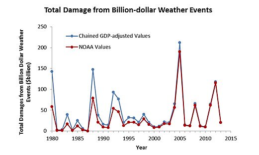
Figure 2. Total annual damage from billion-dollar weather events, 1980–2013. The original (CPI-adjusted) data from NOAA is in red, while our GDP-adjusted data is in blue (data from NOAA).
U.S. Carbon Dioxide Emissions
We are fond to point out that while the current Administration insidiously plots ways of trying to force U.S. carbon dioxide emissions downward, carbon dioxide emissions have been dropping for the past 10 years or so largely as a result of factors other than direct emissions-limiting regulations (etc.) imposed by the federal government. The year 2013 was an exception to this trend. The Energy Information Agency reports that preliminary numbers indicate that carbon dioxide emissions in the U.S. rose by about 2% between 2012 and 2013 (Figure 3). This occurred largely as a result of rising natural gas prices which allowed coal to regain some market share of power production that it had lost to natural gas in recent years. But even with this small increase in emissions, the 2013 carbon dioxide emission were still more than 10% below the 2005 emissions total and still on target to meet the President’s goal of a 17% reduction from 2005 to 2020.
We reiterate our oft-posed question: Since emissions are largely dropping without a great deal of government intervention, why the continued push from the Administration for more regulations?
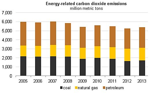
Figure 3. Energy related-carbon dioxide emission from the U.S., 2005–2013 (figure adapted from the EIA).
Global Temperatures
And we’d be remiss not to review the global temperature for 2013.
The liberal-leaning press reports the 2013 global temperature as the seventh (or fourth) highest on record, while the conservative-leaning press reports it as another year in which the global temperature has refused to rise (Figure 4).
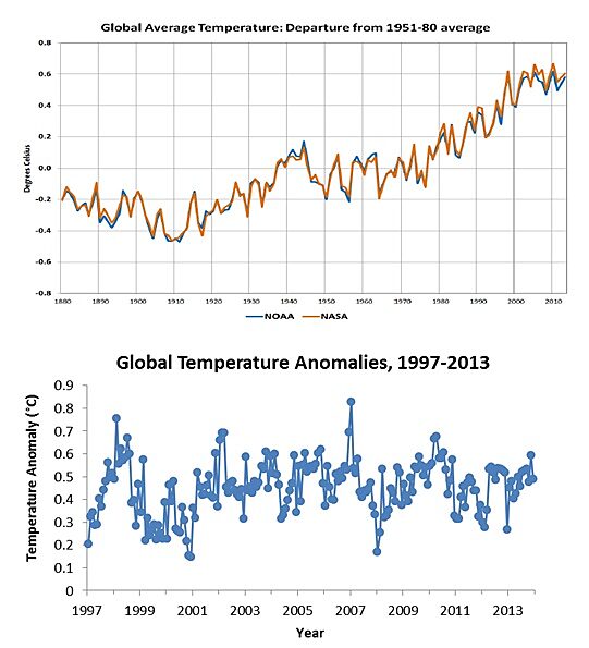
Figure 4. TOP: Annual global surface temperature history, 1880–2013, as compiled by NOAA (blue) and NASA (red) (figure source, NOAA/NASA Joint Briefing). BOTTOM: Monthly global surface temperature anomalies, 1997–2013 (source: U.K. Hadley Center).
But all can agree that the temperatures in 2013 further extended the “pause” in the global surface temperature record-which now stands at some 17 years. A lot of people are at work trying to explain what’s behind the “pause,” but no matter the cause the longer that it continues, the further from reality climate model projections become (Figure 5).
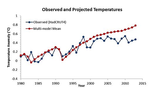
Figure 5. Observed (blue) and projected (red) temperatures, 1980–2013. The projected temperatures are the annual mean of 106 climate runs (data source, Climate Explorer).
The most viable explanation that ties everything together is that the climate sensitivity-that is, how much the earth will warm in response to a doubling of the effective carbon dioxide concentration-is much larger in the climate models than it is in reality.
If this is indeed the case, and there is plenty of evidence to suggest that it is, than the urgency to “do something” about climate change is reduced and so too the level of support for federal regulations aimed at limiting carbon dioxide and thus limiting our energy choices.
