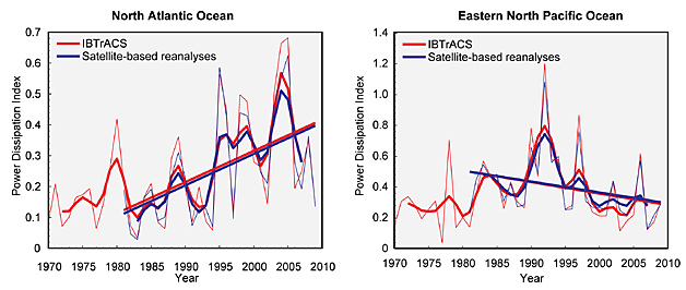
Former Energy Department Undersecretary Steven Koonin caused quite a stir yesterday in an interview with Mary Kissel of The Wall Street Journal when he stated Federal scientists purposefully misled the public about climate change. He recounted that the 2014 National Assessment of Climate Change Impacts in the United States emphasized a dramatic increase in Atlantic hurricane power beginning in 1980. However, this conveniently chosen segment of the historical record does not tell the entire story—the narrative that hurricanes are right now getting more frequent and intense due to climate change just does not stand up to scrutiny.
The offending figure is on Page 42 of the document (reproduced here). It is in Chapter 2 of the report, which is called “Our Changing Climate.”
These are graphs of something called the Power Dissipation Index (PDI) for Atlantic and Eastern North Pacific hurricanes. Note that the data begins in 1970 and ends in 2009. The text explains the beginning date by saying “there is considerable uncertainty in the record prior to the satellite era (early 1970s).”
This is true, but phenomenally disingenuous. Another hurricane scientist, conspicuously absent from the author list, is Chris Landsea of the National Hurricane Center, who developed the Center’s historical hurricane archive, known as HURDAT2. According to Landsea, the problem in the early record (which should be obvious) is that some storms will be missed, not the other way around! In his words, in a 2013 article in Monthly Weather Review, “Some storms were missed, and many intensities are too low in the pre-aircraft reconnaissance era (before 1944 in the western half of the basin) and in the pre-satellite era (before 1972 for the entire basin).
Therefore, prior to 1972, any history is likely to underestimate the PDI rather than overestimate it.
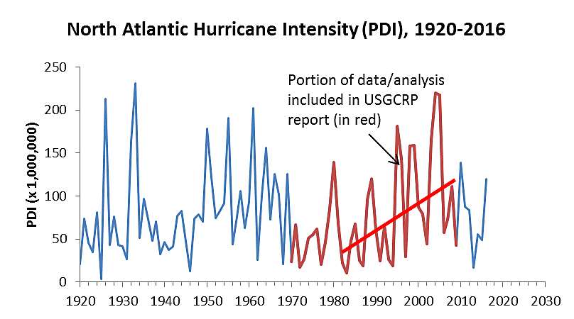
One of us (Maue) calculated the PDI using the HURDAT2 data back to 1920, shown below:
We have included the trend line from the National Assessment. It’s also noteworthy to see what happened after 2009. The accompanying text says “Adapted from Kossin et al. 2007,” meaning they added two more years. Why didn’t they add through 2013, the year before publication of the Assessment? One potential reason is a close look at the chart (which goes through 2016) would have destroyed the narrative.
When the National Oceanic and Atmospheric Administration released the Assessment on May 6, 2014, it said, “The report, a key deliverable of President Obama’s Climate Action Plan, is the most comprehensive and authoritative report ever generated about climate changes that are happening now in the United States…[emphasis added].”
The President’s Action Plan eventually resulted in the Clean Power Plan, arguably the most expensive environmental regulation ever promulgated. The flamboyant, cherry-picked misrepresentation of the hurricane data record was indeed a “deliverable.”
A more “comprehensive” and “authoritative” report would have noted that periodic changes in the north-south gradient of temperature in the Atlantic Ocean (known as the Atlantic Multidecadal Oscillation or AMO) are related to hurricane activity. The trendline in the Assessment begins in a “negative” AMO period, which is associated with suppressed hurricane activity, and ends during a very positive phase which is associated with enhanced hurricanes. A more accurate representation should have begun in 1950, which would have represented a complete AMO cycle. Of course, there wouldn’t be any trend, as expected. Instead, the Assessment cherry picked data to tell a story, and the concocted cheap excuse as to why it did it is risible.
Let’s just quote NOAA’s Geophysical Fluid Dynamics Laboratory updated overview of current research as of April 13, 2017: “It is premature to conclude that human activities – and particularly greenhouse gas emissions that cause global warming – have already had a detectable impact on Atlantic hurricane or global tropical cyclone activity.” Now, that is an entirely different story than we have been told.


