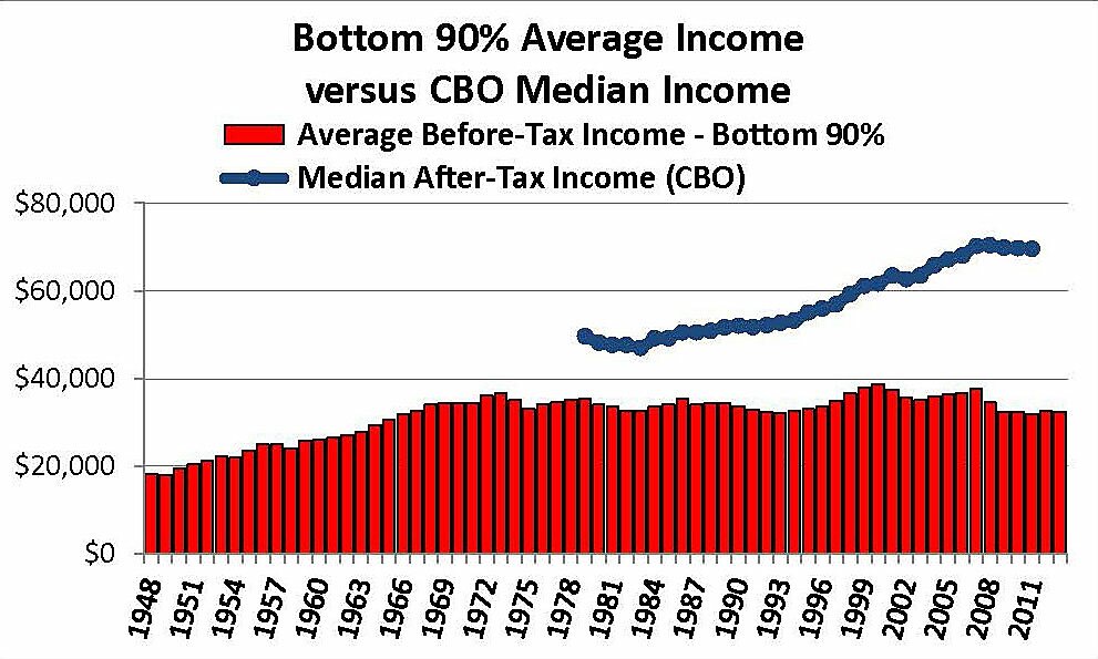
This graph illustrates a few points made in my recent Wall Street Journal article. First of all, the Piketty & Saez mean average of bottom 90% incomes per tax unit is not a credible proxy for median household income, particularly since the big reductions in middle-class taxes from 1981 to 2003.
Second, the red bars claiming bottom 90% incomes in the past six years have been no higher than they were in 1980 (Sen. Warren) or even 1968 (see the graph) is literally unbelievable. If that were true then all other income statistics — including GDP — would have to be completely false.
The Piketty & Saez estimates before 1944 describe total income as Personal Income less 20% (because not all income is reported). Postwar data use a modified version of Adjusted Gross Income as a proxy for personal income, with no transfer payments or health benefits, and that measure has become less and less credible over time. This makes the estimates of bottom 90% incomes simply worthless, as well as related claims that the top 1% “captured” all the cyclical gains (and losses!). If total income were calculated the same way it was in 1928, the the top 1% share would drop from 17.5% to 13.3%. Grossly underestimating total income by greater and greater amounts created an artificial increase in top 1–10% shares of such increasingly understated income.
As the blue line in the graph shows, many measures of income in 2012 or 2013 were not yet back to the peak levels of 2007 or 2000. But that definitely includes real incomes of the top 1%, which were 20.6% lower in 2012–2013 than they were in 2007.

