Global Science Report is a feature from the Center for the Study of Science, where we highlight one or two important new items in the scientific literature or the popular media. For broader and more technical perspectives, consult our monthly “Current Wisdom.”
In preparation for President Obama’s unveiling, today, of the U.S. Environmental Protection Agency’s new proposed regulations to limit carbon dioxide emissions from existing power plants, the EPA has released its updated “Climate Change Indicators in the United States.” As you may have guessed, the report claims manmade climate change is upon us and it is bad.
Last summer, the president announced his Climate Action Plan aimed at mitigating future climate change by executive fiat—in other words, avoiding Congress and public opinion—and simply commanding from on high that U.S. carbon emissions be reduced (never mind that they were already declining, or that any U.S. reductions, no matter how large, would have no meaningful effect on the future course of the climate).
Since then, the administration and the scientists it pays to study global warming have been rolling out report after report pointing to the horrors that have already occurred (like the record-long time since a Category 3 hurricane crossed a U.S. beach?), and how things will certainly get much worse from human-caused global warming if we don’t act now to head it off—that is, stop burning coal to produce electricity.
First was a report from the scientists’ lobby for government funding, the American Association for the Advancement of Science (AAAS), then came the federal National Climate Assessment report, and now the latest from the EPA—just in time for the president to cite in his remarks.
All along we have been saying that these reports are not scientific, but instead are purely political, documents. That became quite clear in last week’s congressional hearing testimony by Daniel B. Botkin, who once believed global warming was a terrible problem, but has since taken the opposite position.
Perhaps there is no finer example of the politicization of “science” than what the “Indicators” report the EPA just handed us.
The figure below is a portion of a screen capture from the “Heat-Related Deaths” section of the EPA’s new “Climate Change Indicators” website. It is labeled “Deaths Classified as ‘Heat-Related’ in the United States, 1979–2010.”
We don’t know anyone who could look at this chart and not be left with the strong impression that heat-related deaths in the United States are on the rise—apparently confirming the president’s concern about climate change and underscoring his desire to do something about it.
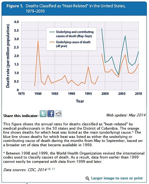
But notice the asterisk at the bottom of the box. Here’s the text associated with it:
Between 1998 and 1999, the World Health Organization revised the international codes used to classify causes of death. As a result, data from earlier than 1999 cannot easily be compared with data from 1999 and later.
In other words, you shouldn’t plot pre- and post-1999 data on the same chart because the data are not comparable, lest you mislead the uninitiated reader. The EPA ignores its own warning and instead plots the two sets of not-easily-compared data side by side on the same chart, ensuring that they are compared!
Such an analysis would probably grade out as an F in an undergraduate paper, but perhaps the EPA is suffering from a bit of “Noble Cause Corruption.” After all, they are trying to save us from certain death.
The proper way to view the EPA chart is to put your hand over the data points on the right-hand side of the chart (1999 and onwards) and then over the data points on the left-hand side of the chart (pre-1999 data). In doing so, you’ll see that during both periods the rate of heat-related mortality does not rise.
For those who want a clearer image of the truth when it comes to the effect of global warming on trends in heat-related mortality across the United States, see the figure below, taken from a brand new study by Jennifer Bobb from the Harvard School for Public Health and colleagues. The graph shows the number of heat-related deaths (for every thousand overall deaths) that result from the daily temperature being 10°F above normal, from 1987 to 2005. The trend is strongly downward—in other words, fewer deaths are associated with heat.
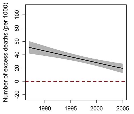
Temporal trends, from 1987 to 2005, in the excess number of deaths (per 1,000 deaths) attributable to each 10°F increase in the same day’s summer temperature, nationally in the United States (excerpted from Bobb et al., 2014).
Or as Bobb and colleagues put it:
This study provides strong evidence that acute (e.g., same-day) heat-related mortality risk has declined over time in the US, even in more recent years. This evidence complements findings from US studies using earlier data from the 1960s through mid-1990s on community-specific mortality rates, as well as European studies that found temporal declines in heat-related mortality risk, and supports the hypothesis that the population is continually adapting to heat. [citations removed]
Not only is the risk from extreme heat declining, but so too are the actual numbers of people dying from extreme heat both in the United States and abroad (when properly standardized for demographic changes and population growth).
This is opposite from what the EPA chart leads you to believe.
The only way for the EPA to be so out of touch with the prevailing science is to be so on purpose.
We can’t help but to think that purpose will be revealed today.
Reference:
Bobb, J.F., R.D. Peng, M.L. Bell, and F. Dominici, 2014. Heat-related mortality and adaptation in the United States, Environmental Health Perspectives, http://dx.doi.org/10.1289/ehp.1307392
