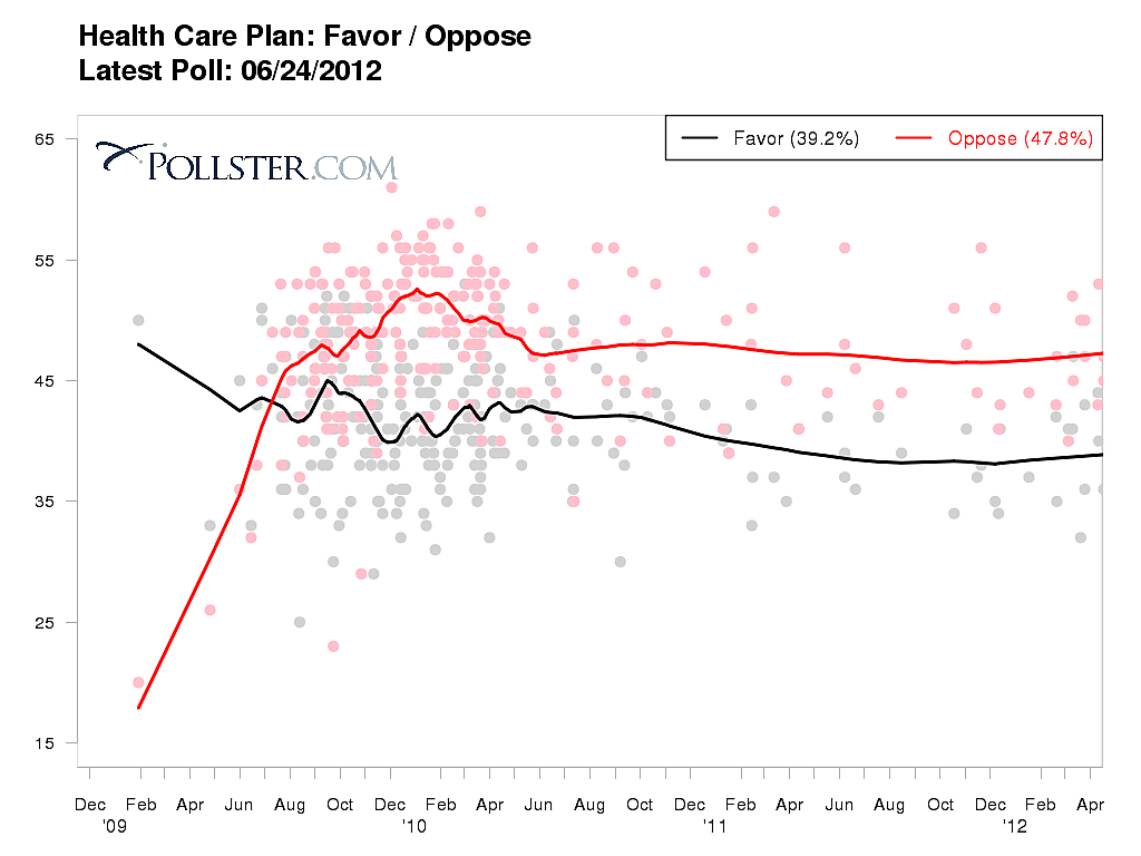
It has been a while since I generated a Pollster.com chart showing support/opposition to ObamaCare among only likely voters, so here goes.
Note that a majority of likely voters oppose ObamaCare, and that opposition exceeds support by nearly 20 percentage points. That’s compared to a 10-point spread among all adults.

