The Laffer Curve is a graphical representation of the relationship between tax rates, tax revenue, and taxable income. It is frequently cited by people who want to explain the common-sense notion that punitive tax rates may not generate much additional revenue if people respond in ways that result in less taxable income.
Unfortunately, some people misinterpret the insights of the Laffer Curve. Politicians, for instance, tend to either pretend it doesn’t exist, or they embrace it with excessive zeal and assume all tax cuts “pay for themselves.”
Another problem is that people assume that tax rates should be set at the revenue-maximizing level. I explained back in 2010 that this was wrong. Policy makers should strive to set tax rates at the growth-maximizing level. But since a growth-generating tax is about as common as a unicorn, what this really means is that tax rates should be set to produce enough revenue to finance the growth-maximizing level of government — as illustrated by the Rahn Curve.
That’s the theory of the Laffer Curve. What about the evidence? Where are the revenue-maximizing and growth-maximizing points on the Laffer Curve?
Well, ask five economists and you’ll get nine answers. In part, this is because the answers vary depending on the type of tax, the country, and the time frame. In other words, there is more than one Laffer Curve.
With those caveats in mind, we have some very interesting research produced by two economists, one from the Federal Reserve and the other from the University of Chicago. They have authored a new study that attempts to measure the revenue-maximizing point on the Laffer Curve for the United States and several European nations. Here’s an excerpt from their research.
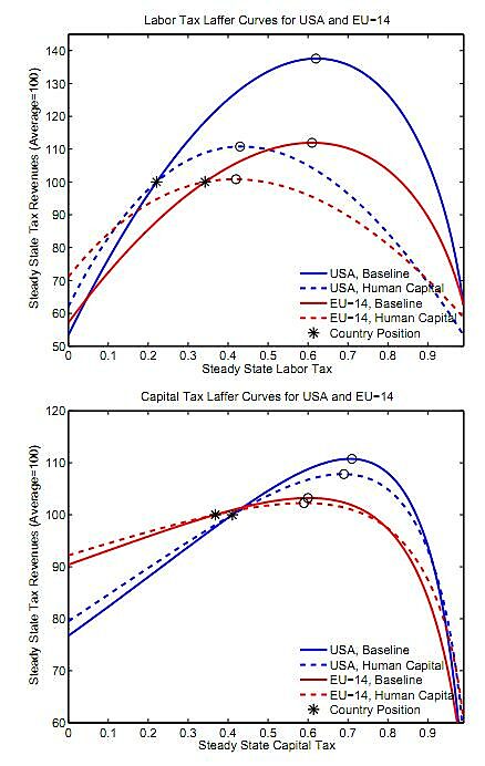
Figure 6 shows the comparison for the US and EU-14. …Interestingly, the capital tax Laffer curve is affected only very little across countries when human capital is introduced. By contrast, the introduction of human capital has important effects for the labor income tax Laffer curve. Several countries are pushed on the slippery slope sides of their labor tax Laffer curves. …human capital turns labor into a stock variable rather than a flow variable as in the baseline model. Higher labor taxes induce households to work less and to acquire less human capital which in turn leads to lower labor income. Consequently, the labor tax base shrinks much more quickly when labor taxes are raised.
There’s a bit of jargon in this passage, so here are the charts from Figure 6. They look complex, but here are the basic facts to make them easy to understand.
The top chart shows the Laffer Curve for labor taxation, and the bottom chart shows the Laffer Curve for capital taxation. And both charts show different curves for the United States and an average of 14 European nations. Last but not least, the charts show how the Laffer Curves change is you add some real-world assumptions about the role of human capital.
Some people will look at these charts and conclude that there should be higher tax rates. After all, neither the U.S. or E.U. nations are at the revenue-maximizing point (though the paper explains that some European nations actually are on the downward-sloping portion of the curve for capital taxes).
But let’s think about what higher tax rates imply, and we’ll focus on the United States. According to the first chart, labor taxes could be approximately doubled before getting to the downward-sloping portion of the curve. But notice that this means that tax revenues only increase by about 10 percent.
This implies that taxable income would be significantly smaller, presumably because of lower output, but also perhaps due to some combination of tax avoidance and tax evasion.
The key factoid (assuming my late-at-night, back-of-the-envelope calculations are right) is that this study implies that the government would reduce private-sector taxable income by about $20 for every $1 of new tax revenue.
Does that seem like good public policy? Ask yourself what sort of politicians are willing to destroy so much private sector output to get their greedy paws on a bit more revenue.
What about capital taxation? According to the second chart, the government could increase the tax rate from about 40 percent to 70 percent before getting to the revenue-maximizing point.
But that 75 percent increase in the tax rate wouldn’t generate much tax revenue, not even a 10 percent increase. So the question then becomes whether it’s good public policy to destroy a large amount of private output in exchange for a small increase in tax revenue.
Once again, the loss of taxable income to the private sector would dwarf the new revenue for the political class. And the question from above bears repeating. What should we think about politicians willing to make that trade?
And that’s the real lesson of the Laffer Curve. Yes, the politicians usually can collect more revenue, but the concomitant damage to the private sector is very large and people have lower living standards. So that leaves us with one final question. Do we think government spending has a sufficiently high rate-of-return to justify that kind of burden? This Rahn Curve video provides the answer.


