Many U.S. politicians are promoting policies to reduce income inequality and poverty by increasing taxes and transferring more income to lower-income households. These proposals rest in part on claims that income inequality in the United States is greater than that in other Western democracies and is growing, and that poverty persists at high levels.
The usual statistics invoked to support those claims, however, are misleading. Those statistics exclude about $1 trillion in annual transfer payments to lower-income households and do not account for the effects of taxes. When those transfers and tax effects are included, income inequality in the United States is lower than that in many Western democracies and has grown at rates similar to income inequality in other nations. Improved estimates of poverty show that only about 2 percent of today’s population lives in poverty, well below the 11 percent to 15 percent that has been reported during the past five decades.
The estimates of inequality and poverty developed here do not, by themselves, determine whether existing redistribution is excessive or insufficient. They do show that the claims of proponents that the current situation is severe and growing worse are exaggerated or inaccurate.
Introduction
Modern American political discourse frequently includes calls to do something about income inequality and poverty. President Lyndon Johnson declared a “War on Poverty” in 1964. Fifty years later, President Barack Obama made income inequality a priority of his second administration, claiming there was “a dangerous and growing inequality ... . It drives everything I do in this office.”1
In her 2016 bid for the presidency, Democrat Hillary Clinton pledged to attack the “cancer of inequality.” Republicans have not adopted this theme as broadly, but some of them have promoted policies such as higher minimum wages, government-mandated child care, expansions of Medicaid, and higher taxes on “the wealthy” as a means to reduce inequality or poverty.
Any discussion of interventions to reduce income inequality or poverty should begin with accurate measures of the actual levels of each. This analysis evaluates the commonly cited numbers and develops better metrics. These improvements provide a better foundation for future analyses on topics such as the causes of the observed income distributions, the ethical case for any intervention, the efficiency and efficacy of existing and proposed remedies, and the economic effects of these policies.
Income inequality and poverty are often conflated, but they are different. We can all be equally poor on $4,000 per year, or equally rich on $1 million per year, but in both of those cases incomes are perfectly equal. And most people would be satisfied in an unequal society with all incomes above $250,000, no matter how much the richest persons might earn. Both topics are considered here because both measures share many technical foundations and rely on the same data source.2
By design, the official estimates of income inequality and poverty omit significant government transfer payments to low-income households; they also ignore taxes paid by households. This paper synthesizes evidence from prior research, provides new quantification for additional gaps, and calculates improved measures of income inequality and poverty.
These more complete estimates show that income inequality and poverty are both smaller than is officially publicized. They counter the claim that inequality is higher in the United States than in other Western democracies, and they show that poverty has declined sharply while income inequality has risen only modestly, in line with trends in other nations.
How Unequal Are Incomes, Really?
The inequality debate is most frequently framed in terms of the differences in money income as measured by the Current Population Survey (CPS) from the U.S. Census Bureau. The Census Bureau defines money income as the sum of the following:3
- Earnings (wages, salaries, and self-employment income)
- Interest income
- Dividend income
- Rents, royalties, estate, and trust income
- Nongovernment retirement pensions and annuities
- Nongovernment survivor pensions and annuities
- Nongovernment disability pensions and annuities
- Social Security
- Unemployment compensation
- Workers’ compensation
- Veterans’ payments other than pensions
- Government retirement pensions and annuities
- Government survivor pensions and annuities
- Government disability pensions and annuities
- Public assistance (includes Temporary Assistance to Needy Families [TANF] funds and other cash welfare)
- Supplemental Security Income (SSI)
- Veterans’ pensions
- Government educational assistance
- Nongovernment educational assistance
- Child support
- Alimony
- Regular contributions from persons not living in the household
- Money income not elsewhere classified
Table 1 summarizes the distribution of household money income in 2015, using data from the Census Bureau supplemented with estimates for the top 1 percent of income-earning households. The Census Bureau sorts all surveyed households by their money income and then separates the ranked set into five groups with equal numbers of households and arranged from the lowest to the highest income. Each fifth, or quintile, represents about 25 million households with income in the ranges shown in Table 1. Thus, the second quintile has about 25 million households with annual incomes greater than $22,800 and less than or equal to $43,511. Because 40 percent of the households have income less than or equal to $43,511, this value is also called the 40th percentile. Note that the upper limit of one quintile is also the lower limit of the next-higher quintile. The highest quintile and other “top” percentile groups are defined by their lower limits.
Table 1: Distribution of United States household income, 2015
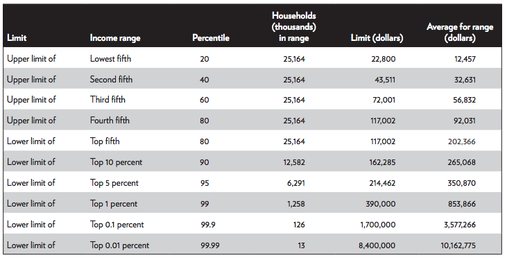
Source: United States Census Bureau, Current Population Survey, 2016 Annual Social and Economic Supplement, 2016. Estimates of the 99th percentile and above are from Mark Price, Estelle Sommeiller, and Ellis Wazeter, “Income Inequality in the U.S. by State, Metropolitan Area, and County,” Economic Policy Institute, June 16, 2016. See Appendix A, Online Technical Appendixes, https://object.cato.org/sites/cato.org/files/pubs/pdf/pa-839-technical-appendixes.pdf, for adjustments to make these estimates more comparable with Census Bureau estimates.
The published differences in the average income between the highest and lowest groups have been offered as proof of significant inequality. For example, the reported average income for the top quintile is 16.2 times larger than the average income for the bottom quintile. But comparisons using the CPS estimates are misleading because they exclude $1 trillion in government transfer payments to lower-income households and they do not account for taxes that reduce the spendable income for higher-income households.
The Missing Transfers
Census money income estimates explicitly exclude the following:4
- The Earned Income Tax Credit (EITC)
- The monetary value of benefits from the Supplemental Nutrition Assistance Program (SNAP), more commonly known as food stamps
- Free or subsidized medical care such as Medicaid and the Children’s Health Insurance Program (CHIP)
- Free, subsidized, or controlled rent or other “affordable housing” schemes
- Heating subsidies
- Free or reduced-fee social services such as daycare, tax preparation, or meal services
The EITC is given to low-income families with at least one employed person. In 2015, the annual credit was as much as $6,242 per household and was given to households with incomes as high as $53,267. The EITC is a “refundable” tax credit, meaning that if an individual owes no income taxes, money equal to the entire credit is sent to the filer. The EITC has all the characteristics of money income, but it is not counted as such by the Census Bureau.
The government has defined the EITC and other refundable credits as “negative taxes.” Government reports of expenditures are understated because the money paid for the EITC payments is not included. Taxes are also understated by the amount of the EITC because it is subtracted from the reported tax collections.
SNAP funds are paid as money on a debit card, but they are defined as in-kind income and not counted because they can nominally be spent only on food. Rent subsidies, free medical care through Medicaid, and any free social services are also deemed as in-kind income and are excluded from the calculations.
Missing Retirement Income
The Census Bureau acknowledges that retirement income is underreported.5 The underreporting results in part from excluding lump-sum payments. Many retirement income payments are monthly, but Individual Retirement Account (IRA) and 401(k) retirement plan disbursements are often lump sums that are put into a bank for the recipient’s later use. The Census Bureau’s money income statistic excludes these lump sums, and the subsequent withdrawals from the bank are not counted either.
Compared with amounts reported to the Internal Revenue Service (IRS), the CPS underestimates retirement income by at least 60 percent in each income quintile. IRS data show 50 percent more households with private pension income, and for those households reporting pension income the IRS shows 50 percent more income than the CPS does.6 No one would report too much income to the IRS, so the higher IRS comparisons are reliably the minimum limit of underreporting.
Missing Taxes
Official income statistics make no adjustments for taxes paid. Taxes reduce spendable income at every income level. Most people pay sales taxes. Almost all working people are assessed payroll or self-employment taxes. The tax burden rises sharply with income so that a household in the top 5 percent of the income distribution pays half or more of its marginal income for federal and state taxes that are not paid by households in the lowest 40 percent of income.
The net effect is that pretax data overstate the true income of upper-income households by as much as 50 percent, and missing transfers understate the true income of lower-income households by a factor of two or more. If the government were to raise taxes on the wealthy tomorrow and transfer all the additional money to the lowest income groups through a larger EITC, the official metrics of inequality would not budge by a single cipher because neither the new taxes taken from the top nor the additional income transfers given to the bottom would be used in the calculations.
The Congressional Budget Office Plugs Some Of The Holes
The Congressional Budget Office (CBO) provides more comprehensive income estimates than the Census Bureau, although they, too, are unnecessarily incomplete. The CBO’s chief improvements are as follows:7
- It estimates “market income” by adding capital gains, employer-paid benefits, and the share of corporate taxes that are ultimately borne by workers to the earned income portion of the Census Bureau’s money income.
- In addition to the transfers included by the Census Bureau, the CBO adds food stamps, Medicaid, and CHIP. But it still excludes about $900 billion in other transfers.
- The CBO subtracts 93 percent of federal taxes. It does not subtract state and local taxes, and it counts the EITC as a negative tax.
- Finally, market income plus transfers minus federal taxes equals the net income after transfers and taxes, or spendable income.
The CBO results are shown in Table 2, with one modification. The EITC has been reclassified from a negative tax to an “other transfer.” The table shows the proportion of market income, transfers, and federal taxes received or paid by each fifth of the population. For example, the lowest income fifth makes only 2.2 percent of the total market income. This low earned income is augmented by a 32.3 percent share of Social Security and Medicare transfers and 39.4 percent of other transfers. Households in the lowest fifth contribute only 0.8 percent of all federal taxes. The net result is that although the lowest income group has only 2.2 percent of earned income, it receives 8.3 percent of spendable income available for consumption and savings.
Table 2: Percentage of selected financial totals contributed by each market income group, 2013
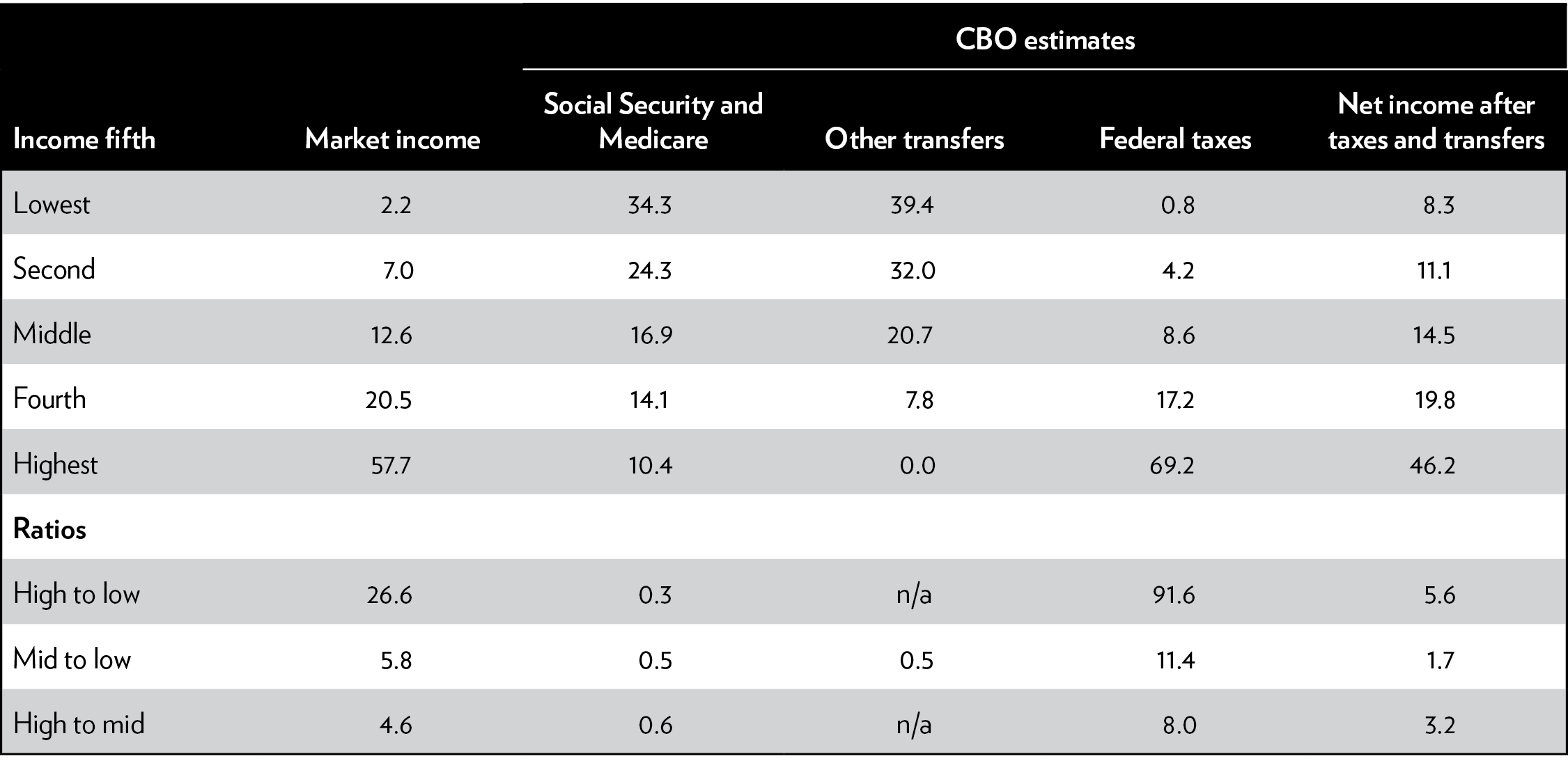
Source: Congressional Budget Office, “The Distribution of Household Income and Federal Taxes, 2013,” November 2016.
Notes: Author adapted data to (a) move EITC from a negative tax to a positive transfer, (b) reconcile taxes to a market-income-group basis, and (c) adjust rounding to ensure consistency with other data. CBO = Congressional Budget Office; n/a = not applicable.
The ratios in the last three rows of Table 2 show the degree of inequality in the components that determine spendable income. Average market earnings in the highest income group are 26.6 times those in the lowest. But the lowest income group gets 3.3 times more in Social Security and Medicare. It also receives 39.4 percent of other transfers, whereas the highest group gets essentially none. The highest income group pays 91.6 times more taxes. The net result is that the highest group averages 5.6 times more spendable income than the lowest. As measured by the CBO, government intervention with transfer payments and taxes has cut the difference between the top and bottom quintiles by a factor of five.
Market Income
Higher-income households have more earners per household, work longer hours, have completed higher levels of education, have greater experience, and saved more for retirement. In the lowest quintile, 66 percent of the households have no one working. With 36 percent of the heads of household in this group over the age of 65, many of the nonworkers are retired, but 30 percent of the households have working-age individuals, none of whom are working.
Social Security and Medicare
Because most individuals earn less after retirement, a greater proportion of Social Security and Medicare transfers goes to people in lower market-income groups. But some transfers from Social Security and Medicare go to seniors in higher income groups because those individuals continue to work beyond the official retirement age or have income from savings.
The design of Social Security benefits contributes to the downward shift in the senior income. People can start drawing benefits as early as age 62. Monthly benefits for early claimants are reduced by as much as 25 percent for life. Despite the lower benefit, 66 percent of beneficiaries choose to retire early. Only 1.5 percent delay their claims until age 70, when their benefits would be 32 percent higher than at the full-retirement age.8 The choice of early benefits accounts for many beneficiaries being in the first income quintile rather than the second and in the second quintile rather than the third.
Not only do the Social Security and Medicare benefit structures increase incentives to retire early at smaller monthly benefits; they also create substantial transfers from individuals who earned more during their working years to those who earned less. Beneficiaries in the lowest income quintile during their working years receive 10 times more benefits per dollar contributed than those in the top two quintiles.9
Other Transfers
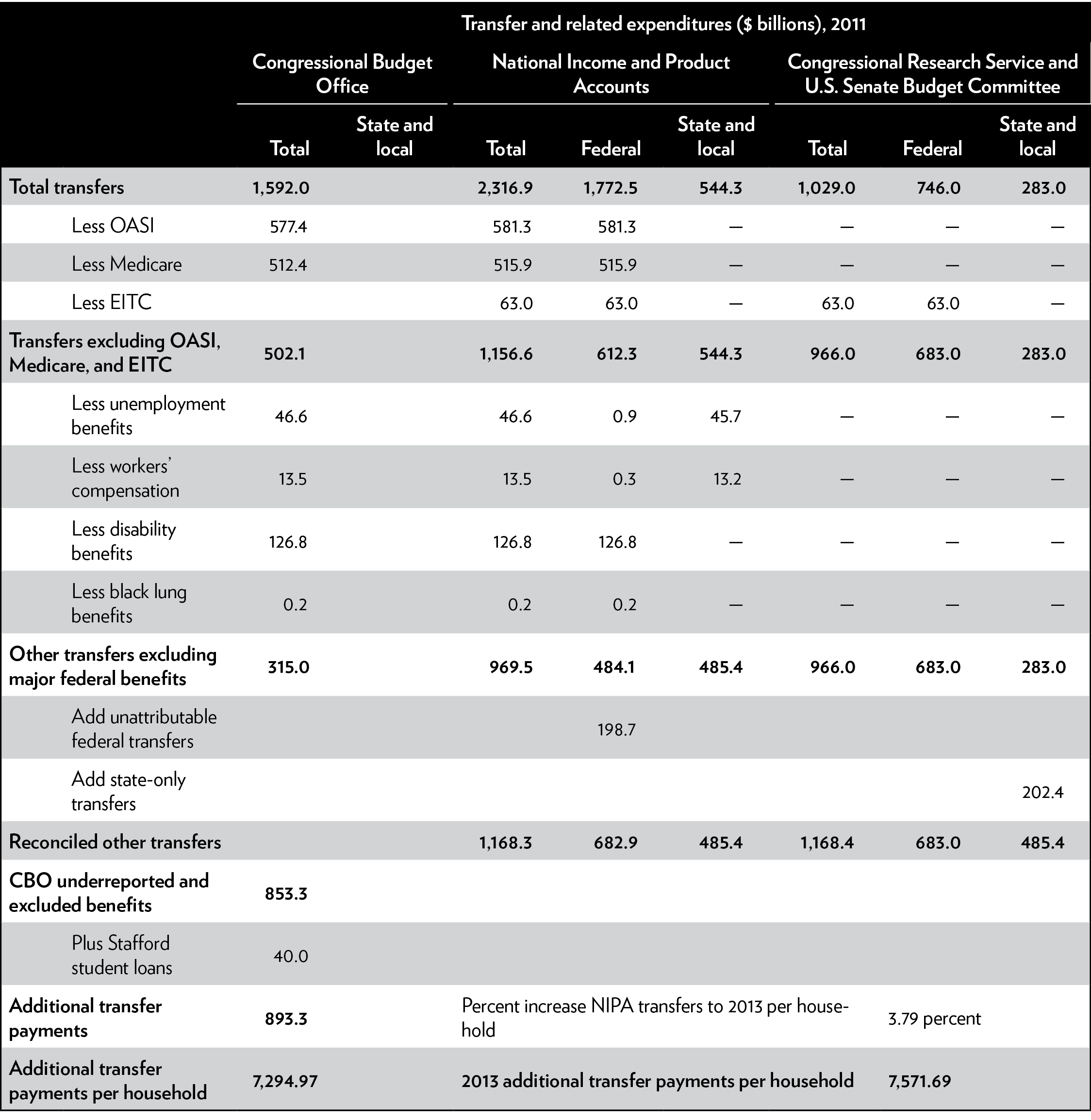
The CBO data still exclude substantial transfer payments to the lower-income groups. “Other transfers” in the CBO data average $4,300 per household, which implies a total of $526 billion. The Bureau of Economic Analysis, in its preparation of the National Income and Product Accounts (NIPA), reports a total of $1,124.5 billion—more than twice as much as the CBO data—for the same period.
The Congressional Research Service (CRS) has listed 83 federal welfare programs with total appropriations of $746 billion. The CBO estimates include only seven of them.10 Many of these programs require state matching funds. The CRS identified only the federal portion. The Senate Budget Committee (SBC) staff identified $283 billion in state matching funds for these same 83 programs, yielding a grand total of $1.03 trillion per year, with most of it going to lower-income households.11
The CRS/SBC numbers do not include some transfers that are not entirely need based but that still flow disproportionately to low-income families.12 They also exclude state welfare programs without federal matching funds.
Table 3 reconciles the estimates from these three data sources.13 Each source is shown in a set of columns. The NIPA and CRS/SBC data are available separately for federal, state, and local transfers. The CBO published only federal programs.
Table 3: Reconciliation of total income transfers and computation of additional transfers
Sources: Bureau of Economic Analysis, “National Income and Product Accounts,” www.bea.gov; Social Security Administration, “Annual Statistical Supplement to the Social Security Bulletin,” 2013 (for Social Security, Medicare, unemployment benefits, workers’ compensation, and black lung); United States Senate Budget Committee, “CRS Report: Welfare Spending the Largest Item in the Federal Budget,” 2013; and Congressional Research Service, “Spending for Federal Benefits and Services for People with Low Income, FY2008–2011: An Update of Table B-1 from CRS Report R41625,” October 16, 2012 (for means tested programs).
Note: EITC = Earned Income Tax Credit; NIPA = National Income and Product Accounts; OASI = Old-Age and Survivors Insurance; — = not applicable.
The top of Table 3 shows how each of seven identifiable transfers are included in each source. Other transfers are more problematic and constitute approximately $1,168 billion annually. The CBO uses only $315 billion of that total. In addition, another $40 billion of federal student loan subsidies and forgiveness to lower-income households is excluded by all three sources because the subsidies and loan forgiveness are not direct money payments to the beneficiary, are not reported on income tax returns, and are excluded from federal financial reports owing to legislation that forbids accounting for risks of defaulted loans. Adding the missing student loan subsidies yields a total of $7,294.97 per household for transfers excluded by the CBO in 2011, or $7,516.33 per household in 2013—75 percent more than the number used by the CBO.
These benefits are valued at the actual tax dollars paid. Any extra market value to the recipient beyond the cost has not been added. For instance, government compels hospitals and physicians to accept below-market rates for Medicare and Medicaid patients, so the actual value of the government-provided care is higher than the cost. Similarly, the Federal Trade Commission’s free broadband mobile phones for low-income individuals are valued at the payment to the carriers, which reflects only the marginal cost and profit. Fixed network costs are covered by paying customers purchasing the costlier market-priced phone services. As a result of using cost rather than market price to value benefits, the estimate for transfers is a conservative lower bound of the actual value transferred.
Federal Taxes
The CBO excludes approximately 7 percent of federal taxes, consisting primarily of Federal Reserve fees that are included in everybody’s costs of financial transactions, tariffs on imports, and estate and gift taxes. It also excludes unemployment insurance fees assessed on the first $7,000 of employee pay.
State Taxes
The CBO does not subtract state and local taxes, which are only 25 percent smaller than federal taxes. The tax burdens of individual states range from 12.7 percent of income in New York to less than half that amount in Alaska.14
The effect of state and local taxes on different income quintiles varies from locale to locale. On average, state and local income taxes are about 15 percent less progressive than federal taxes.15 However, five states, constituting 22 percent of the U.S. population, have income tax rates that are more progressive, and seven states have no income tax at all.16
Most states impose sales taxes, which are theoretically somewhat regressive. But the regressive effects are modulated by states excluding such necessities as food, medicine, shelter, and some apparel items from sales tax.
State and local property taxes affect higher-income households more directly, although 42 percent of poor households do own their own homes. The indirect effects of property taxes on rent are muted at lower incomes by rent regulations, subsidies, and exemptions.
Spendable Income after Missing Taxes and Transfers
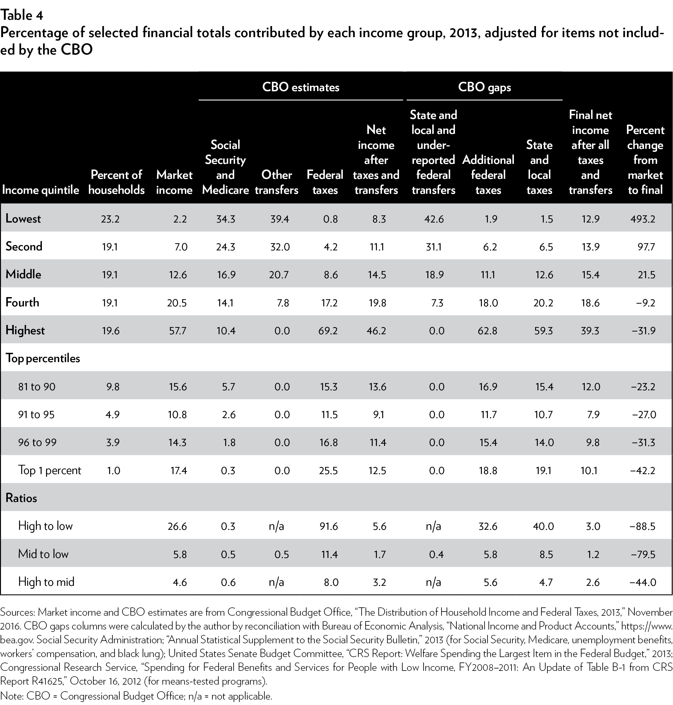
Table 4 incorporates the income effects of transfers and taxes that are missing from the CBO calculations. These improved calculations continue to be conservative underestimates of redistribution because reliable estimates have not been developed for transfers such as government-compelled housing “affordability” regulations, hospital cost shifting, and state unattributable transfers.
The lowest income quintile in the CBO reports accounted for 8.3 percent of spendable income, but after adding some of the missing transfers, its share of household income rises by about half to 12.9 percent of spendable income. The highest income quintile exhibits a complementary pattern. The CBO data show that this group receives 46.2 percent of spendable income, but the effect of state and local taxes drops its share to 39.3 percent.
The last column in the table calculates the percentage change from the average market income earned by households in each income quintile to the final spendable income after transfers and taxes. The average income share for the lowest quintile rose by 493.2 percent—a nearly sixfold increase. The second-lowest quintile gained 97.7 percent, almost doubling its earnings share. The middle-income group received a 21.5 percent premium over its share of market earnings. The two highest income groups lost 9.2 percent and 31.9 percent of their respective earnings shares through taxation.
The last three rows in Table 4 display the ratios between selected income groups for the various contributing factors. The “High to low” row shows the following dynamics:
- The highest income quintile earned an average of 26.6 times more market income than the lowest group.
- The lowest quintile added to its income share by receiving 3.3 times more Social Security and Medicare and capturing more than 40 percent of all other transfers.
- The highest income group lost income share by paying 91.6 times more federal tax and 40.0 times more state and local tax.
- The net result was that the average spendable income for the highest income group was only three times higher than that for the lowest group.
- Government redistribution eliminated 88.5 percent of the ratio between the highest and lowest market income quintiles.
- The 3.0:1 ratio in spendable income between the highest and lowest quintiles is more than five times smaller than the 16.2:1 ratio highlighted by the annual Census Bureau money income estimate.
The ratios show that the middle-income group averages only 20 percent more spendable income than that of the lowest group. Government income redistribution basically flattens out the bottom 60 percent of income to within 20 percent of each other. The difference in taxes reduces the distance between the highest group and the middle group, lowering the ratio of highest to middle by 44 percent, from 3.2:1 to 2.6:1.
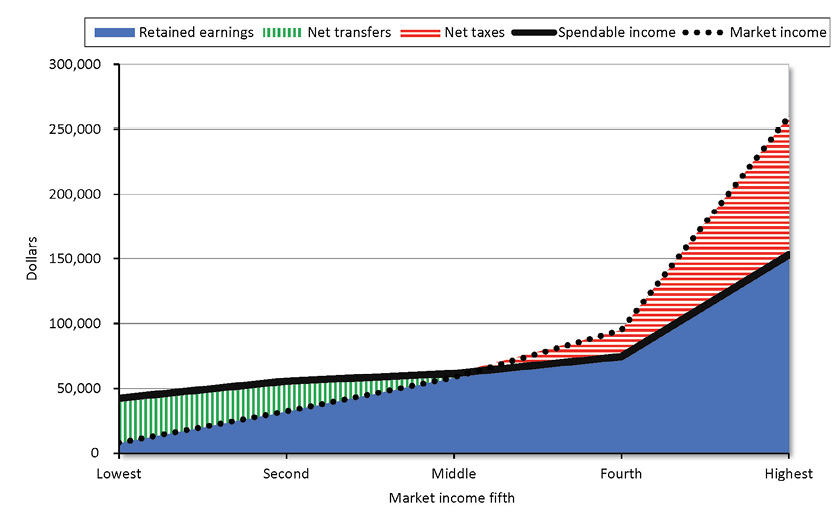
Figure 1 summarizes the same data graphically. The solid area at the bottom shows the market earnings that the household retains after net taxes. The two lowest income groups receive net welfare transfers, which are shown as the vertical stripes stacked on top of their earned income. For the middle group, transfers and taxes approximately offset each other, with a small overall addition from redistribution. Net transfers continue through the 52nd percentile, after which households pay net taxes. As income rises above the 52nd percentile, the horizontally striped area displays the taxes that the average household in each group paid net of transfers.
Figure 1: Average income, transfers, and taxes by income groups, 2013
Sources: Market income from Congressional Budget Office, “The Distribution of Household Income and Federal Taxes, 2013,” November 2016. Others computed by author from Congressional Budget Office, “The Distribution of Household Income and Federal Taxes, 2013,” November 2016; Bureau of Economic Analysis, “National Income and Product Accounts,” https://www.bea.gov; Social Security Administration, “Annual Statistical Supplement to the Social Security Bulletin,” 2013 (for Social Security, Medicare, unemployment benefits, workers’ compensation, and black lung); United States Senate Budget Committee, “CRS Report: Welfare Spending the Largest Item in the Federal Budget,” 2013; and Congressional Research Service, “Spending for Federal Benefits and Services for People with Low Income, FY2008–2011: An Update of Table B-1 from CRS Report R41625,” October 16, 2012.
Figure 1 illustrates the dynamics of redistribution in the United States. On average, households with $63,136 in earned market income get to keep it all. They pay taxes averaging approximately $17,000 per year, but on average they also get an equal amount of government transfers. Households with earned income less than $63,136 constituted 52.5 percent of all households and on average received net benefit payments from government. Some of the 47.5 percent of households above the break-even point also got transfer payments, but they paid more taxes than the transfers they received.
The top 47.5 percent of households were taxed to do the following:
- Transfer enough money to the bottom 52.5 percent of households, to give them average spendable incomes close to the median income
- Pay for the many activities of government that require 40 percent of all government spending
- Pay the interest on the national debt, which constitutes 12 percent of government expenditures17
The Gini Coefficient Measurement of Inequality
Advocates of “doing something” about income inequality often use a computation called the Gini coefficient to claim that income inequality in the United States is greater than that in other Western democracies and that it has been increasing.
The Gini coefficient has a theoretical minimum of 0.000 that represents no inequality, with everyone having exactly the same income. Its theoretical maximum is 1.000, representing total inequality with one person having all the income and everyone else having nothing. Intermediate values are designated as proportions of inequality; for example, 0.500 is defined to mean half unequal.18
A widely used source for Gini coefficients is the CIA’s World Factbook, which is readily available on the internet.19 There are three problems with using this source:
- It mixes two different types of data, using money income for some countries and spendable income after taxes and transfers for others, which results in false comparisons between countries.
- Many of the data it uses are as much as seven years older than others.
- The numbers for the United States do not agree with the official Census Bureau numbers, and the World Factbook provides no documentation for the difference.
The Census Bureau calculates the United States Gini coefficients using household money income, with no reductions for taxes paid or additions for missing transfers. Most other countries calculate their coefficients using income after subtracting taxes and adding most transfers. The World Factbook uses the money income for the United States and Japan and after-tax-and-transfer income for most other nations, so the United States and Japan are biased toward higher coefficients. (See Figure 2.)
Figure 2: Gini coefficients of various income measures in advanced nations
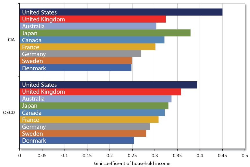
Sources: Central Intelligence Agency, The World Factbook, https://www.cia.gov/library/publications/resources/the-world-factbook/rankorder/2172rank.html; and Organisation for Economic Co-operation and Development, “OECD (2017), Income Inequality (indicator),” DOI: 10.1787/459aa7f1-en, https://data.oecd.org/inequality/income-inequality.htm.
The Organisation for Economic Co-operation and Development (OECD) has created a set of more closely comparable coefficients for after-tax-and-transfer spendable income. Nevertheless, OECD explicitly excludes Medicaid transfers and state and local taxes. The OECD claims that the Medicaid exclusion is required because there is no easy way to make a comparable comparison with other nations that have national health services paying for everybody. Failing to include it at all is far more biasing, however, and as the aforementioned CBO calculations indicate, inclusion is entirely possible. The exclusion of state and local transfers and taxes creates a comparative upward bias for the United States because its state and local governments are a greater part of the total.
Figure 2 contains both the CIA and OECD Gini coefficients for the United States plus six other large, well-developed economies and Denmark and Sweden, which are the two OECD nations with the smallest (least unequal) Gini coefficients.
Even if we accept the Gini coefficient as meaningful, the OECD data for the United States show only a modest difference from those of other countries, accounting for only 26 percent of the total range of values. The other countries account for 74 percent of the range. Furthermore, per capita income in the United States is between 16 percent and 40 percent higher than that of any of the other countries (see Figure 3). Even if there really are some small differences in income equality, on average a household at any point in the income distribution for the United States will have higher income than a household at the corresponding point for the other countries.
Figure 3: Per capita national income by country, 2016
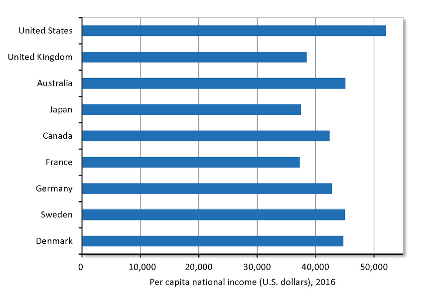
Source: Organisation for Economic Co-operation and Development, OECD Factbook 2016, “Gross Domestic Product (GDP): GDP per Head, US $, Constant Prices, Constant PPPs, Reference Year 2010 Data,” OECD.Stat.
The “USA Complete” Gini coefficient in Figure 4 includes Medicaid, other missing transfers, and state and local taxes. Adjusting for these missing elements reduces the coefficient to 0.23, lower than that of any of the comparison countries. Although some other national coefficients may also be missing components, it is unlikely that the effects would be as large. The OECD’s explicit omission of Medicaid is the only item it identifies for any nation, and Medicaid is the largest nonsenior transfer in the United States.
Figure 4: Gini coefficients of spendable income in advanced nations, including more complete USA coefficient
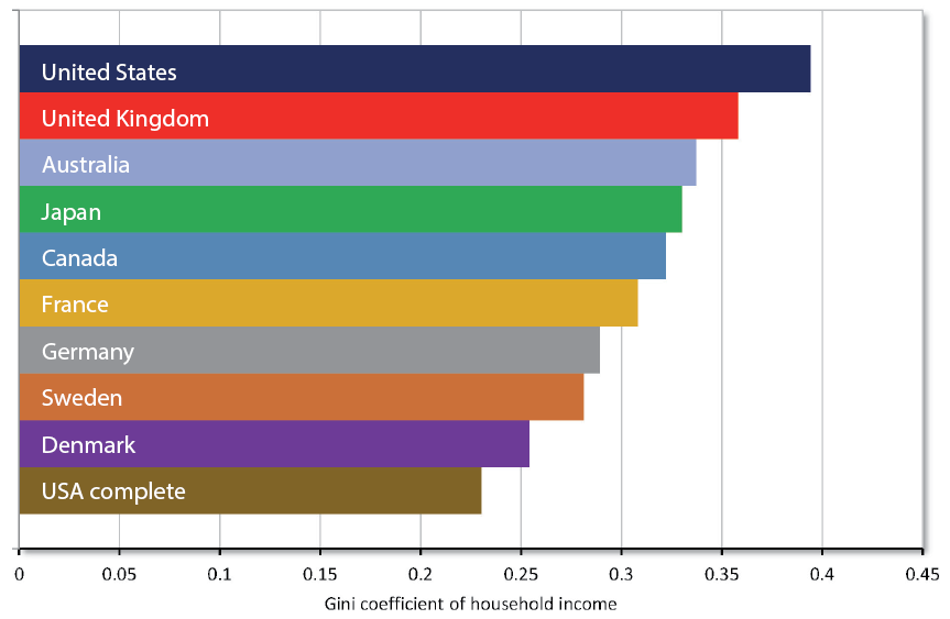
Sources: Organisation for Economic Co-operation and Development, OECD (2017), “Income inequality (indicator),” DOI: 10.1787/459aa7f1-en, https://data.oecd.org/inequality/income-inequality.htm; USA Complete: Author’s calculations from Congressional Budget Office, “The Distribution of Household Income and Federal Taxes, 2013,” November 2016; Bureau of Economic Analysis, “National Income and Product Accounts,” https://www.bea.gov; Social Security Administration, “Annual Statistical Supplement to the Social Security Bulletin,” 2013 (for Social Security, Medicare, unemployment benefits, workers’ compensation, and black lung); United States Senate Budget Committee, “CRS Report: Welfare Spending the Largest Item in the Federal Budget,” 2013; and Congressional Research Service, “Spending for Federal Benefits and Services for People with Low Income, FY2008–2011: An Update of Table B-1 from CRS Report R41625,” October 16, 2012.
The omission of state and local taxes also does not affect any of the other nations significantly. Even in Canada, Australia, and Germany (the only nations in the set with substantial state governments), the central government collects most of the taxes and reapportions them to the states and localities. Any adjustments for these taxes would, therefore, be small for countries other than the United States.
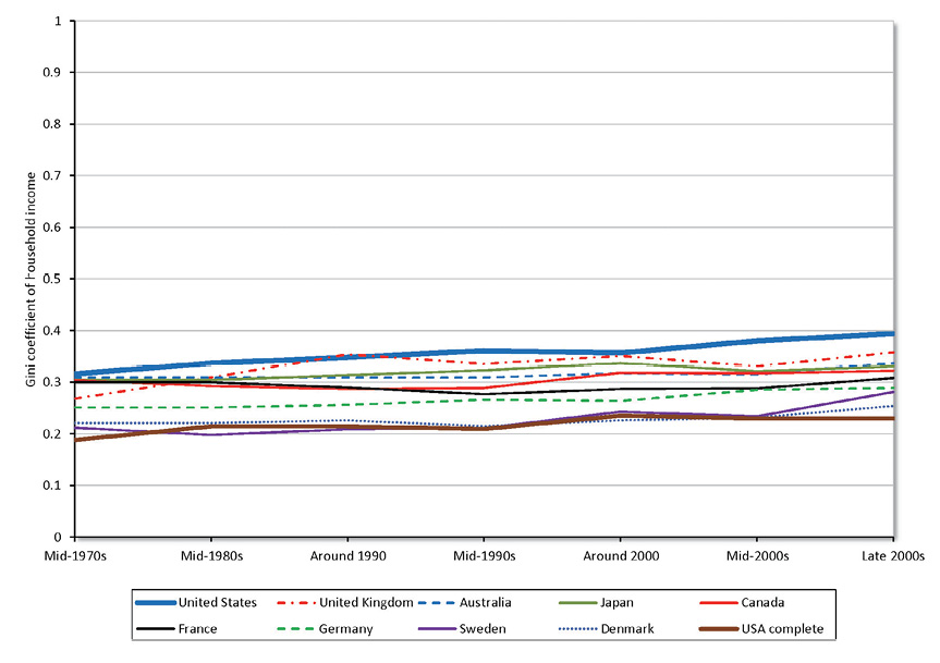
Promoters of the Gini coefficient argue that the United States has become more unequal over time. The historical Gini coefficients in Figure 5 show that every country except France rose similarly during the past three decades. The United States trend is exaggerated by the exclusions noted earlier, particularly because Medicaid grew more rapidly than other transfers. The USA Complete line reflects the more accurate accounting of transfers and state taxes.20
The consistency of the trends among the nations is striking, despite their differences in economic and finance policies. Whatever is driving this slow trend must be affecting most developed nations in roughly the same way. Global economic forces are at work here, not some idiosyncratic explanations for the United States.
Figure 5: International trends in Gini coefficient of household income
Sources: Organisation for Economic Co-operation and Development, OECD (2017), “Income inequality (indicator),” DOI: 10.1787/459aa7f1-en, https://data.oecd.org/inequality/income-inequality.htm; USA Complete: Author’s calculations from Congressional Budget Office, “The Distribution of Household Income and Federal Taxes, 2013,” November 2016; Bureau of Economic Analysis, “National Income and Product Accounts,” https://www.bea.gov; Social Security Administration, “Annual Statistical Supplement to the Social Security Bulletin,” 2013 (for Social Security, Medicare, unemployment benefits, workers’ compensation, and black lung); United States Senate Budget Committee, “CRS Report: Welfare Spending the Largest Item in the Federal Budget,” 2013; and Congressional Research Service, “Spending for Federal Benefits and Services for People with Low Income, FY2008–2011: An Update of Table B-1 from CRS Report R41625,” October 16, 2012.
Note: Many countries publish their data on a less-than-annual basis. The time scale reflects the approximate timing. Individual observations may be as much as four years different from the reference point.
Two Swedish economists evaluated trends in the proportion of total income earned by the top 1 percent of earners over the last 100 years in Australia, Canada, France, the Netherlands, Sweden, the United Kingdom, and the United States.21 The economists noted that irrespective of the policy differences among the seven, all showed the same basic trends, much as Gini coefficients do. Economist Allan Meltzer of Carnegie Mellon University noted that this commonality likely arises from the global shifts that affected all seven countries, such as adding several hundred million Chinese and Indian workers and consumers to global markets and more “knowledge work” that places a premium on capability.22 Economic growth inherently creates more jobs at the upper end of the compensation range, with higher returns to their occupants because those people create more value, which naturally increases the distance between the bottom and top.
The Incidence of Poverty Has Fallen Significantly
As noted earlier, poverty is a different subject than income inequality. Poverty denotes living on an income deemed less than sufficient to provide for basic needs. As such, measuring the incidence of poverty starts with a poverty threshold: the point on some financial measure below which people are designated “poor.”
The U.S. government stipulates poverty thresholds of money income for each of 48 different types and sizes of families. The thresholds were first set for 1963 using a 1955 U.S. Department of Agriculture Food Consumption Survey showing that, on average, families spent one-third of their after-tax income on food, combined with data on the cost of a nutritionally adequate but economical diet for each family type in 1963. The thresholds were then set at three times the cost of the economical diet. Since then, each threshold has been escalated by the rate of change in the Consumer Price Index for All Urban Consumers (CPI-U).
The Census Bureau uses the CPS family money incomes to identify families with incomes below their relevant thresholds and calculates the proportion of all individuals residing in those families.23 For 2015, the Census Bureau reported that 13.5 percent of the population lived in poverty, the same as the average for the preceding 48 years. Figure 6 shows the oscillation of the poverty rate between 11.1 percent and 15.2 percent with no meaningful trend.24
Figure 6: Percentage of population below poverty threshold, 1947–2015
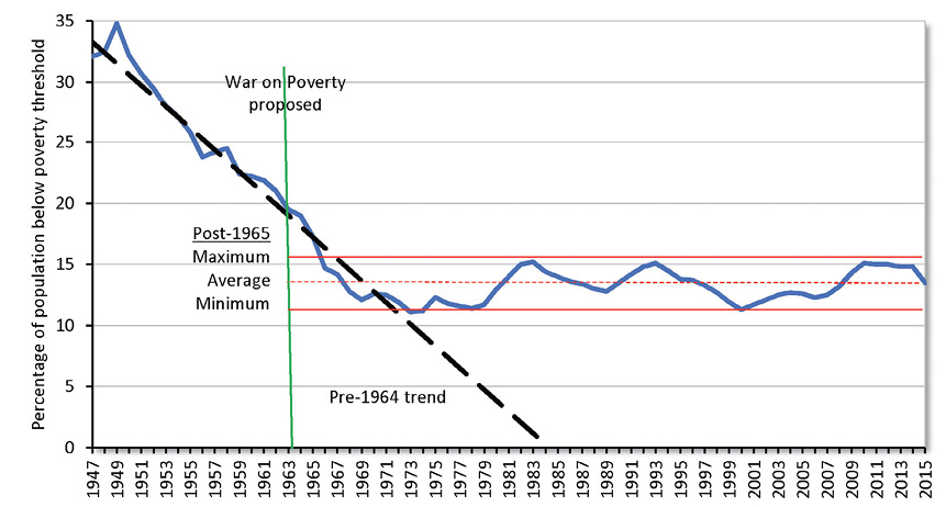
Sources: For 1959–2015, U.S. Census Bureau, “Income and Poverty in the United States: 2015,” Table B-1. For earlier data, Gordon Fisher, “Estimates of the Poverty Population under the Current Official Definition for Years Before 1959,” U.S. Department of Health and Human Services, Office of the Assistant Secretary for Planning and Evaluation, 1986.
During the 15 years before President Johnson’s announcement of the War on Poverty, the measured poverty rate had fallen from 34.8 percent to 19.0 percent. Two years after Johnson’s speech and before most of the new programs were fully implemented, the rate had dropped to 14.7 percent, well within the range that would prevail for the next 48 years.
The official measures seem to show that the War on Poverty failed to reduce the incidence of poverty. Even more strikingly, the data show that the systematic improvement trend of the mid-20th century stopped after the War on Poverty began. However, a large part of the apparent failure results from flaws in the way poverty is measured.
Effect of Uncounted Income on Poverty Measures
In 1963, almost all welfare benefits were delivered by direct monetary payments, all of which were counted in the income published from the CPS survey. But the War on Poverty and many subsequent programs such as Medicaid, food stamps, and the EITC were excluded from the CPS measure of money income. The $1 trillion-plus in annual transfer payments that are not counted in the official inequality measurements are also omitted from the income used for the poverty measures. As a result, the count of people in poverty is inflated. In effect, the new programs, by definition, could not improve the official measurement of poverty, even as they were raising the spendable incomes of low-income people.
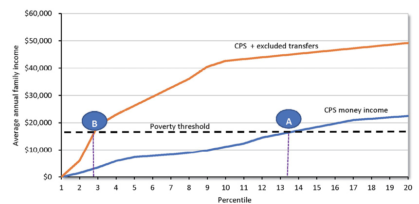
Figure 7 shows the average annual income for the 20 lowest percentiles for 2015. The lower curve is the CPS money income data used to calculate poverty incidence. The upper curve includes the transfers that the Census Bureau omits. The threshold intersects the CPS money income curve at point A, the official poverty rate of 13.5 percent of the population.
Figure 7: Incidence of poverty adjusted for excluded transfers, 2015
Sources: For CPS money income data: United States Census Bureau, “Current Population Survey, 2016 Annual Social and Economic Supplement,” 2016. Excluded transfers: author calculations on Congressional Budget Office, “The Distribution of Household Income and Federal Taxes, 2013,” November 2016; Bureau of Economic Analysis, “National Income and Product Accounts,” https://www.bea.gov; Social Security Administration, “Annual Statistical Supplement to the Social Security Bulletin,” 2013 (for Social Security, Medicare, unemployment benefits, workers’ compensation, and black lung); United States Senate Budget Committee, “CRS Report: Welfare Spending the Largest Item in the Federal Budget,” 2013; Congressional Research Service, “Spending for Federal Benefits and Services for People with Low Income, FY2008–2011: An Update of Table B-1 from CRS Report R41625,” October 16, 2012. For poverty thresholds: U.S. Census Bureau, “Income and Poverty in the United States: 2015,” November 2016, p. 43. Calculations by author.
Note: CPS = Current Population Survey.
The “CPS + excluded transfers” curve reflects the higher actual incomes resulting from a fuller accounting of transfer payments. It intersects the poverty threshold just below 3 percent of the population, point B. Missing transfer payments have caused poverty to be overstated fourfold.
Upward Bias from Escalation
Escalating the poverty thresholds by the CPI-U overstates the money needed to maintain the standard of living established by the 1963 poverty benchmark. This excess arises from economic constructs and technical methods used in price-index construction.25 The Bureau of Labor Statistics publishes an alternative research estimate of consumer price change, the CPI-U-RS, that overcomes some of these limitations.
Researchers have also identified additional biases not addressed by the CPI-U-RS. Bruce Meyer and James Sullivan have integrated the CPI-U-RS with several of these research results to create estimates for poverty rates based on a reduced-bias calculation of price change.26 The results are compared with the official numbers in Figure 8.
Figure 8: Effect of adjusting poverty threshold to remove pricing biases
Sources: U.S. Census Bureau, “Income and Poverty in the United States: 2015,” Table B-1, for official measure 1959–2015. For earlier data, Gordon Fisher, “Estimates of the Poverty Population Under the Current Official Definition for Years Before 1959,” U.S. Department of Health and Human Services, Office of the Assistant Secretary for Planning and Evaluation, 1986. Estimates using adjusted CPI-U-RS from Bruce D. Meyer and James X. Sullivan, “Winning the War: Poverty from the Great Society to the Great Recession,” NBER Working Paper 18718, January 2013, http://www.nber.org/papers/w18718.
Notes: Author extended series from 2010 to 2015 and rebased the indexed level from 1980 to 1963. CPI-U-RS = Consumer Price Index for All Urban Consumers Research Series.
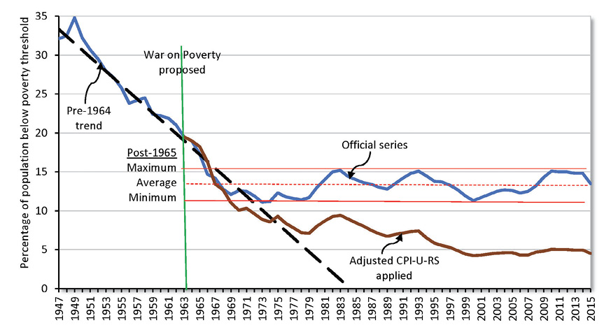
These improved estimates of price change yield a different picture of the trend for poverty. The official measure’s downward trend ended in the 1960s. The improved measure continued to decline for another 30 years until the turn of the millennium, albeit more slowly and with some cyclical bumps. The bias-adjusted poverty measure stabilized just below 5 percent, less than half the minimum 11.1 percent achieved by the official number in 1973.
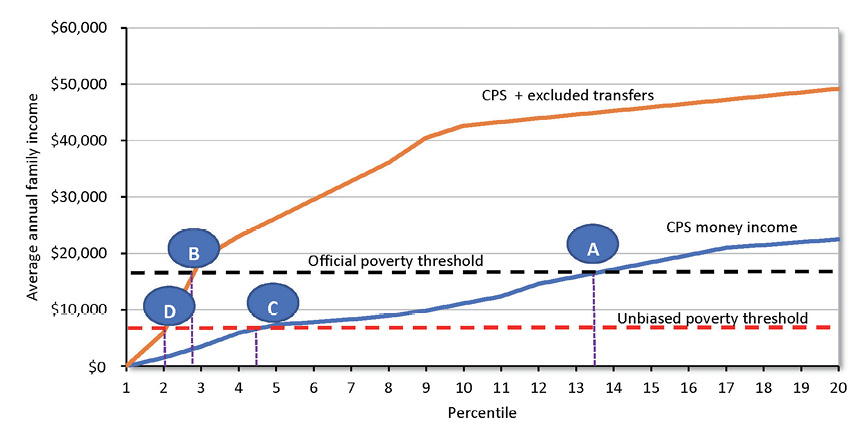
Figure 9 combines these improved price adjustments for the thresholds with the more complete accounting of income to create a still-lower estimate of poverty incidence.
Figure 9: Incidence of poverty adjusted for excluded transfers and biased Consumer Price Index
Sources: For CPS Money income data: United States Census Bureau, Current Population Survey, 2016 Annual Social and Economic Supplement, 2016. Excluded transfers: author calculations on Congressional Budget Office, “The Distribution of Household Income and Federal Taxes, 2013,” November 2016; Bureau of Economic Analysis, “National Income and Product Accounts,” https://www.bea.gov; Social Security Administration, “Annual Statistical Supplement to the Social Security Bulletin,” 2013 (for Social Security, Medicare, unemployment benefits, workers’ compensation, and black lung); United States Senate Budget Committee, “CRS Report: Welfare Spending the Largest Item in the Federal Budget,” 2013; Congressional Research Service, “Spending for Federal Benefits and Services for People with Low Income, FY2008–2011: An Update of Table B-1 from CRS Report R41625,” October 16, 2012; Congressional Budget Office, “The Distribution of Household Income and Federal Taxes, 2013,” November 2016. For poverty thresholds: U.S. Census Bureau, “Income and Poverty in the United States: 2015,” November 2016, p. 43 (calculations by author); U.S. Census Bureau, “Income and Poverty in the United States: 2015,” Table B-1 (for official measure 1959-2015). For earlier data: Gordon Fisher, “Estimates of the Poverty Population under the Current Official Definition for Years Before 1959,” U.S. Department of Health and Human Services, Office of the Assistant Secretary for Planning and Evaluation, 1986. Estimates using adjusted CPI-U-RS are from Bruce D. Meyer and James X. Sullivan, “Winning the War: Poverty from the Great Society to the Great Recession,” NBER Working Paper no. 18718, January 2013, http://www.nber.org/papers/w18718.
Note: CPS = Current Population Survey.
As in Figure 7, point A in Figure 9 is the current official estimate of 13.5 percent poverty incidence, and point B shows the 3 percent result when missing income transfers are added. Point C identifies the 4.5 percent result from applying the reduced-bias poverty threshold to the official income definitions. Finally, point D shows that using both the improved threshold and the more complete income estimates yields a 2 percent incidence rate.
The Temporary Nature of Poverty and Unequal Income
Some individuals remain in poverty for much, if not all, of their lives. But for most people, poverty is a temporary condition. Even the biased official measures show the following transient nature of poverty and income status:
- Between 2009 and 2012, 34.5 percent of the population had at least one episode of poverty lasting two or more months.27
- Only 2.7 percent of the population lived in poverty for all 48 months during that period.28
- Some 61 percent of households earn in the top quintile for at least two consecutive years during their lives.29
- About half of all households in the bottom quintile will rise to a higher quintile within 10 years.30
- Two-thirds of children reared in the lowest quintile escape to a higher one as adults, and two-thirds of children reared in the highest quintile drop to a lower one.31
Other Alternatives for Measuring Poverty
Several alternatives have been suggested to replace or supplement the current official measure of poverty. One would be to define poverty thresholds in terms of consumption rather than income. Individuals’ well-being is likely determined more by the goods and services consumed than by the income received. The two are related, but a family’s consumption usually varies less over time. A majority of the officially poor experience only short episodes of poverty. During those episodes, they can compensate for lost income by using assets such as savings, owned homes, and owned automobiles, or they may borrow. Consumption includes in-kind support that families receive that is not counted in the official figures. Consumption will also rise when after-tax income increases as the result of reduced taxes. Measures based on this consumption approach show a pronounced decline in the incidence of poverty over the last half-century.32
The Census Bureau publishes a single supplemental measure of poverty that is based largely on a report from a 1995 National Academy of Sciences committee. This measure includes food stamps and the EITC as part of income, but it still ignores transfers to low-income families amounting to more than three-quarters of a trillion dollars.
This supplemental measure also creates three new upward biases. First, it sets the thresholds by using actual expenditures at the 30th to 36th percentiles of spending for food, clothing, shelter, and utilities and adding 20 percent to that total for other expenditures. This construct substitutes an inequality metric for a poverty metric. Poverty measured by this method could be eliminated only by forcing massive changes in the differences of individual expenditures by both the poor and the nonpoor.
A second bias escalates the base value by the percentage change in consumption for food, clothing, shelter, and utilities. The upward bias in this case is even more pronounced than the use of the CPI-U because it not only includes price changes but also increases the quantities consumed. As overall prosperity increases, this so-called poverty threshold increases the standard of living labeled “poor.”
Finally, the supplemental measure also deducts job-related expenses and out-of-pocket health care spending from income before determining whether a family is poor. Since a portion of these expenses is included in the baseline threshold, the method results in some double counting. The health care reduction is particularly problematic. Creators of this measure justify special treatment of health care spending by calling it an “investment” rather than consumption.33 But if this distinction is correct, then plenty of other spending should be deemed investment; it is not clear how getting vaccinations should be treated differently from eating broccoli to promote wellness or from keeping warm to discourage upper respiratory infections.
The alternative treatment also adopts an imputation algorithm “to reflect the underutilization of health care by the uninsured.”34 This technique assumes that the poor would spend the same out-of-pocket amounts on health care as the rest of the population does, if they had the money. It then subtracts this hypothetical out-of-pocket spending from their actual income. This method overstates the income deduction, understates income, and thus creates an upward bias in the incidence of poverty. Most poor people are eligible for, and enrolled in, Medicaid. Medicaid requires no deductibles and no copays; low-income seniors are also exempted from most cost sharing. Private insurance has substantial cost sharing. So if one imputes out-of-pocket spending on cost sharing—which, in fact, most poor do not face—the size of the bias is even larger.
The effect of the supplemental method is to raise the poverty estimate from 13.5 percent to 14.3 percent in 2015.35 With so many alternative measures in the literature that yield substantially smaller estimates, the government has decided to identify and highlight only a single alternative, one that shows more poverty.36
Another alternative is to follow the OECD and most Western European countries and define the poverty threshold as 50 percent or 60 percent of median income. This approach is a pure inequality measure and is not consistent with the usual meaning of the word “poor.”
The 1963 U.S. poverty benchmark had within it the seeds of another approach to setting thresholds. It used a so-called normative approach to food and defined a nutritious, economical market basket of food as the minimum necessary to provide for basic needs. Then it priced the cost of that market basket. Similar approaches to shelter, clothing, utilities, and other expenditures were also discussed at the time, but they were not pursued, largely because the normative food baskets were already defined for four different spending levels and it was easy to move ahead with a measure relying only on existing statistics. Many limitations of the current approaches could be avoided by adopting and pricing explicit normative thresholds for the full consumption market basket.
Independent Validation of the Overstatement of Poverty
Other independent data confirm that only small numbers of Americans live in conditions that would normally be considered poverty. These data show that families classified as poor have lifestyles that would usually be considered middle class. For example:37
- Only about 2.5 percent of the U.S. population has even a single day of hunger or malnutrition in a year.
- Only about 1 percent of the population lives in housing that is severely inadequate or crowded—one-fourth as many as in 1975. Less than one-half of 1 percent of the population is homeless for even a short time during a year.
- Most families that are defined as “poor” have many goods and services that would be classified as luxury items. Air conditioning is seven times more prevalent among poor families today than among the general population when the War on Poverty began. Most poor families have microwave ovens, at least one vehicle, video games, flat-screen TVs, and personal computers.
These metrics are consistent with the improved measures that show about 2 percent poverty prevalence.
Conclusion
More than 50 years after the United States declared the War on Poverty, poverty is almost entirely gone. Government spends more than $1 trillion annually in the name of reducing poverty. Yet the measurement system continues to report no reduction in poverty, and substantial taxpayer dollars go to people who are not poor.
The public has also been misled by similar false signals about income inequality. The official estimates are deficient on several dimensions and exaggerate the degree of income inequality.
Public policy debate should begin with the realization that only about 2 percent of the population—not 13.5 percent—live in poverty. Government annually takes more than $1 trillion from above-average earners and gives it to low earners so that all except a small fraction receive middle-income status. As a result, income inequality in America is not significantly different from that of other advanced nations.
The policy debate now has a firm quantitative foundation for evaluating whether more spending or less spending on poverty and income equality is desirable and how that spending should be structured. Additional analysis can explore the ethical, efficacy, efficiency, and overall economic health dimensions of inequality and poverty policy in the context of more accurate estimates of the underlying economic measures.
Notes
1. Barack Obama, “Remarks by the President on Economic Mobility,” White House Press Office, https://obamawhitehouse.archives.gov/the-press-office/2013/12/04/remarks-president-economic-mobility.
2. The Annual Social and Economic Supplement (ASEC) from the Current Population Survey (CPS) conducted by the United States Census Bureau.
3. United States Census Bureau, Current Population Survey (CPS), Income Definitions, https://www.census.gov/cps/data/incdef.html. Various Census publications have similar lists, but this list is the most complete and fully defined.
4. United States Census Bureau, “Appendix A, Definitions and Explanations,” Current Population Reports, Consumer Income, P60-200 (Washington, June 4, 1998), A1–A5.
5. United States Census Bureau, “Appendix A, Definitions and Explanations,” Current Population Reports, Consumer Income, P60-200 (Washington, September 1998), A1–A5. Beginning in 2014, some improvements were made, but their effect has yet to be fully evaluated.
6. Sylvester J. Schieber and Andrew G. Biggs “Retirees Aren’t Headed for the Poor House,” Wall Street Journal, January 24, 2014, https://www.wsj.com/articles/andrew-biggs-and-sylvester-schieber-retire…. (Schieber is former chair of the Social Security Advisory Board and Biggs is former principal deputy commissioner of Social Security.) Also, Chris E. Anguelov, Howard M. Iams, and Patrick J. Purcell, “Shifting Income Sources of the Aged,” Social Security Administration, Office of Retirement and Disability Policy, Social Security Bulletin 72, no. 3 (2012); and Alicia H. Munnell and Anqi Chen, “Do Census Data Understate Retirement Income?,” Center for Retirement Research at Boston College, Number 14-19, Boston (December 2014).
7. For a fuller explanation of the improvements, see “Appendix B, Online Technical Appendixes,” https://object.cato.org/sites/cato.org/files/pubs/pdf/pa-839-technical-….
8. Social Security Administration, Annual Statistical Supplement to the Social Security Bulletin, 2013, table 6.B5 (Washington: Social Security Administration, 2015). The net difference between delaying benefits to age 70 versus age 62 is 76 percent. Note that this difference is strictly an actuarial result. Delaying benefits means that the beneficiary will get benefits for eight fewer years. The actuarially expected total payments will be the same over a lifetime, but the observed income at a point in time will be substantially smaller for an early claimant.
9. See “Appendix C, Online Technical Appendixes,” https://object.cato.org/sites/cato.org/files/pubs/pdf/pa-839-technical-…, for the technical details of this calculation.
10. Congressional Research Service, Spending for Federal Benefits and Services for People with Low Incomes, FY2008–FY2011 (Washington, October 16, 2013). See “Appendix D, Online Technical Appendixes,” https://object.cato.org/sites/cato.org/files/pubs/pdf/pa-839-technical-…, for the full program list.
11. United States Senate Budget Committee, CRS Report: Welfare Spending the Largest Item in the Federal Budget (Washington, 2013). Data sources for the report included Centers for Medicare and Medicaid Services and the Oxford Handbook of State and Local Government Finance.
12. See “Appendix E, Online Technical Appendixes,” https://object.cato.org/sites/cato.org/files/pubs/pdf/pa-839-technical-…, for a list. There is no systematic basis for excluding these transfers. Social Security and Medicare are included, and they are not entirely need based. They have very steep disproportionate redistribution formulas, as do most of the excluded transfers. The exclusion of Lifeline free telephones makes no sense because they are distributed on the basis of participation in other need-based programs.
13. CRS has not updated these numbers since 2011, so the reconciliation of the CBO, NIPA, and CRS data sources is constructed for that year only and then updated to 2013 by the rate of change in per-household transfers from the NIPA. Note that all these data predate the additional transfer payments from the Affordable Care Act beginning in 2014.
14. The Tax Foundation, “Facts & Figures: How Does Your State Compare?,” Table 2, Excel spreadsheet, https://taxfoundation.org/facts-figures-2017/.
15. Frank Sammartino and Norton Francis, Federal-State Income Tax Progressivity, Tax Policy Center, June 2016, http://www.urban.org/sites/default/files/publication/82051/2000847-federal-state-income-tax-progressivity_0.pdf. Their estimates are used in the calculations in this paper.
16. Lyman Stone, “Which States Have the Most Progressive Income Taxes?,” Tax Foundation, September 24, 2014, https://taxfoundation.org/which-states-have-most-progressive-income-taxes-0/.
17. United States Department of Commerce, Bureau of Economic Analysis, National Income and Product Accounts, computed from Tables 3.1, 3.22 and 3.23, https://www.bea.gov/iTable/iTable.cfm?reqid=19&step=2#reqid=19&step=2&isuri=1&1921=survey.
18. The Gini coefficient is presented here as a general concept. More details plus a discussion of some of the statistical limitations and flaws in the Gini construct are provided in “Appendix F, Online Technical Appendixes,” https://object.cato.org/sites/cato.org/files/pubs/pdf/pa-839-technical-….
19. United States Central Intelligence Agency, The World Factbook, https://www.cia.gov/library/publications/resources/the-world-factbook/r….
20. Data are not available to reconstruct the USA Complete for the full history, so trends from the CBO history of net after-tax income are used to estimate the USA Complete historical trend. See Figure 14: Gini Indexes Based on Market, Before-Tax, and After-Tax Income, 1979 to 2013, in The Distribution of Household Income and Federal Taxes, 2013 (Washington: Congressional Budget Office, November 2016).
21. Jesper Roine and Daniel Waldenstrom, “The Evolution of Top Incomes in an Egalitarian Society: Sweden, 1903–2004,” Journal of Public Economics 92, no. 1–2 (February 2008): 366–87.
22. Allan H. Meltzer, “A Look at the Global One Percent,” Wall Street Journal, March 9, 2012.
23. Official poverty measures use income for a family, which is on average a smaller unit than the household used for income and inequality reporting.
24. Technically, if a trend line were fitted to the data, it would show an increase of 1.4 percentage points over the 48 years.
25. See “Appendix G, Online Technical Appendixes,” https://object.cato.org/sites/cato.org/files/pubs/pdf/pa-839-technical-…, for a fuller description of these biasing factors.
26. Bruce D. Meyer and James X. Sullivan, “Winning the War: Poverty from the Great Society to the Great Recession.” NBER Working Paper No. 18718, National Bureau of Economic Research, Cambridge, MA, January 2013.
27. United States Census Bureau, Income and Poverty in the United States: 2015 (Washington, November 2016), p. 3.
28. United States Census Bureau, Income and Poverty in the United States: 2015, p. 3.
29. Mark Rank and Thomas Hirschl, “The Life Course Dynamics of Affluence,” PLOS One, January 28, 2015, http://journals.plos.org/plosone/article?id=10.1371/journal.pone.0116370.
30. U.S. Department of the Treasury, “Income Mobility in the U.S. from 1996 to 2005,” November 13, 2007, https://www.treasury.gov/resource-center/tax-policy/Documents/Report-Income-Mobility-2008.pdf.
31. Raj Chetty, Nathaniel Hendren, Patrick Kline, et al., “Where Is the Land of Opportunity? The Geography of Intergenerational Mobility in the United States,” Table II, NBER Working Paper No. 19843, National Bureau of Economic Research, Cambridge, MA, January 2014,http://www.nber.org/papers/w19843.
32. Bruce D. Meyer and James X. Sullivan, “Winning the War: Poverty from the Great Society to the Great Recession,” NBER Working Paper No.18718, National Bureau of Economic Research, Cambridge, MA, January 2013.
33. Kathleen Short, U.S. Census Bureau, Current Population Reports, P60-216, Experimental Poverty Measures: 1999 (Washington: Government Printing Office, October 2001), p. 60.
34. Ibid.
35. Trudi Renwick and Liana Fox, U.S. Census Bureau, Current Population Reports, P60-258, The Supplemental Poverty Measure: 2015 (Washington: Government Printing Office, September 2016), https://www.census.gov/library/publications/2016/demo/p60-258.html.
36. See “Appendix H, Online Technical Appendixes,” https://object.cato.org/sites/cato.org/files/pubs/pdf/pa-839-technical-…, for a brief history of early failed efforts to improve the inclusivity of the income definitions.
37. See “Appendix I, Online Technical Appendixes,” https://object.cato.org/sites/cato.org/files/pubs/pdf/pa-839-technical-…, for a fuller compilation of the relevant data and their sources.

About the Author


This work is licensed under a Creative Commons Attribution-NonCommercial-ShareAlike 4.0 International License.