Dear Capitolisters,
I hope you enjoyed Capitolism’s summer vacation as much as I did. I only wish I were as rested as I am tan—an impossibility given my olive complexion and exuberant 8‑year-old daughter. Anyway, this week I want to talk about economic inequality in the United States, as it drives so much of the current policy debate in Washington. As I noted a few weeks ago, for example, bipartisan calls for U.S. protectionism are often driven by an unquestioned presumption among political elites that the gap between the rich and the poor—or between “capital” and “labor”—has dramatically accelerated in recent years, fueling populist backlash (and maybe the election of Donald Trump) in the process. The belief similarly undergirds proposals for substantial (and often radical) changes to U.S. economic policy, such as wealth taxes, wage mandates, and antitrust actions. And it’s a foundational pillar of “Bidenomics,” which rejects the neoliberal “Washington Consensus” in favor of more government spending, higher taxes, “looser” monetary policy, and greater economic regulation.
But the state of economic inequality in the United States is also wildly misreported—if not entirely wrong—and a rash of new studies show why. So that’s what we’ll dig through today.
Definitions Matter
Probably the biggest problem infecting the current discussion of economic inequality is that some of the most widely-cited work on American incomes and wealth are misleading (at best) because of how they define the economic terms at issue.
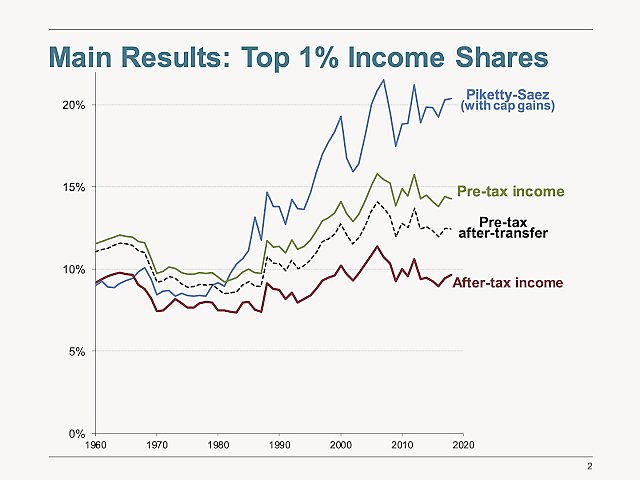
Let’s start with incomes. As helpfully summarized by the Hoover Institution’s John Cochrane a few months ago, economists Gerald Auten and David Splinter have thoroughly dismantled the well-publicized findings of Thomas Piketty and Emmanuel Saez on rising income inequality. In particular, the former duo find that the latter nipped and tucked their definition of “income” to ignore all sorts of variables that—coincidentally, I’m sure!—substantially inflate U.S. income inequality over time. Cochrane notes a few of them:
-
Omitted income. Piketty Saez leave out many kinds of income. Auten Splinter attribute all national income to somebody. Before 1986 many wealthy people were incorporated. Leaving out corporate income biases the early shares down. Auten Splinter fix that.
-
Pre-tax and transfer income! Who cares about pre-tax income! Auten Splinter calculate income after taxes at the top—lower—and including transfers at the bottom—higher.
-
Demographics. Marriage rates have fallen, so Auten Splinter calculate income by individuals. Benefits! They include benefits like employer-provided health insurance.
Correcting for these issues reveals that the scourge of American income inequality isn’t so, umm, scourge‑y after all:
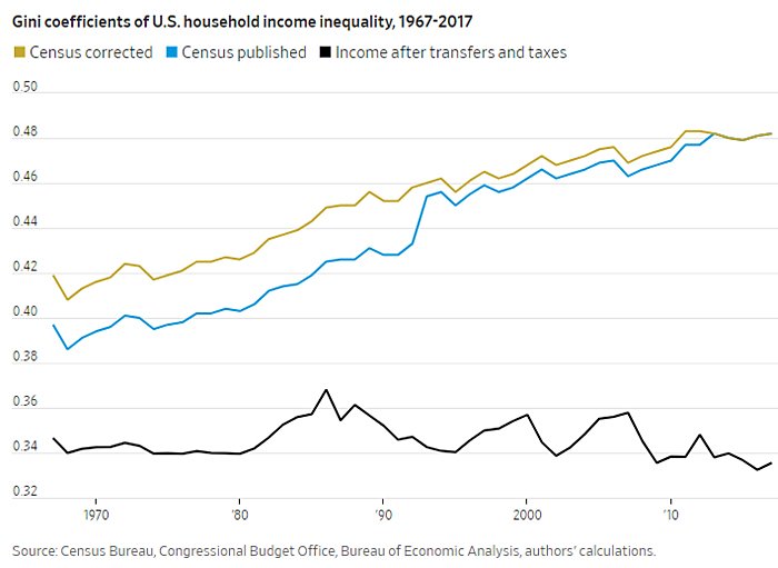
In the Wall Street Journal, former Senator Phil Gramm and labor economist John Early perform a similar exercise for the “Gini coefficient”—a common measure of inequality in which 0 represents perfect equality and 1 represents perfect inequality—by accounting for taxes and transfers in the Census Bureau’s household income data (which mostly don’t): “if you count all government transfers (minus administrative costs) as income to the recipient household, reduce household income by taxes paid, and correct for two major discontinuities in the time-series data on income inequality that were caused solely by changes in Census Bureau data-collection methods, the claim that income inequality is growing on a secular basis collapses.”
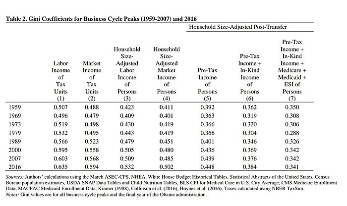
If the source of these data makes you skeptical, well you’re in luck: A year earlier, a group of academic economists found essentially the same thing when including in the Census numbers government tax and transfer programs (especially in-kind transfers like Medicaid) and adjusting for household size (column 7 in the following table):
And AEI’s Scott Winship performed a similar exercise on these pages using Congressional Budget Office data (which adjusts for taxes and some transfer income), finding that “the only substantial increase in inequality since 1947 occurred during the 1980s. The Gini was 0.41 in 1989 and 0.43 in 2017, and based on the Census Bureau data, it was probably no higher in 2019.”
In short, American income inequality basically disappears when you consider government policies and the actual financial resources (post-tax/transfer) available to the poor and middle class, instead of just the top line of their paychecks. (And other data issues might further moderate these trends.) To argue that we need more government interventions to fix an “income inequality” that exists only in the absence of current government interventions is misleading (at best).
Definitional problems also pervade the debate about the supposedly declining share of national income going to workers (the “labor share”) versus owners of capital (the “capital share”)—another common target of the populist right and left. As the Tax Foundation’s Erica York explained in an April briefing note, however, the most common depictions of a declining U.S. labor share have been derived from gross domestic income measurements and thus omit the crucial fact that “[s]ome capital income does not actually end up in people’s pocketbooks because it is paid directly to the government in taxes or because it is used to replace worn down assets” (i.e., “depreciation” expenses). When York excludes both categories of income—income that doesn’t add to “capital” and thus shouldn’t be counted when determining whether the group is today benefiting more—from U.S. Bureau of Economic Analysis (BEA) calculation of Gross Domestic Income (GDI), it results in a much different picture of the historical trend in capital income and labor income earned on net by people in the United States:
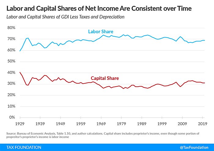
York then summarizes supporting research papers from economists Benjamin Bridgman and Matthew Rognile, concluding that:
These studies find that the shares of net income going to labor and capital have not changed substantially over more than 90 years. Both shares are well within their historical range, and recent changes are primarily driven by factors like exclusions for employer-provided health insurance and the returns to owner-occupied housing.
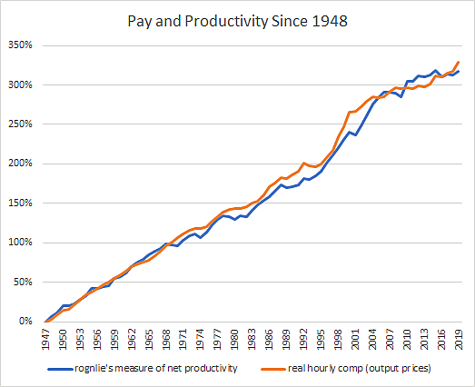
Using Rognile’s latest data, moreover, economist Donald Schneider finds that—again contra the populist conventional wisdom—“there’s no decoupling of pay and productivity” (a trend often cited to show that too-powerful “capital” is suppressing the incomes of weak, un-unionized American workers).
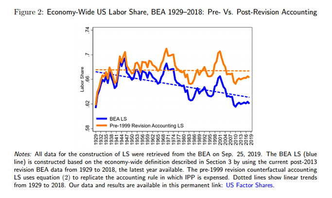
Even if you disagree that net income is the appropriate way to assess the “labor versus capital” situation, there are other important factors that undermine the case for government doing anything about it. For example, a new NBER paper finds that “standard estimates of the recent decline in labor’s share of national income are likely to overstate the drop by failing to account for a large fraction of compensation in the form of equity grants and stock options.” Including equity-based compensation substantially moderates (and, for high-skilled labor, almost eliminates) the decline in workers’ share of corporate earnings. Another recent paper finds that there is no decline in the labor share once you factor in how BEA changed its treatment of intellectual property products (IPPs) in the national income and product accounts that are used to calculate the labor/capital shares. Put simply, BEA starting in 1999 began to treat entities’ spending on research and development and “artistic originals” (music, books, etc.) as “capital income” instead of a business expense, thus mechanically raising the “capital share” and lowering the “labor share” as U.S. IPP investment rises, which it has done for decades. If you revert back to treating all IPP spending as a business expense (yellow line below), the labor share’s secular decline disappears:
Finally, we find similar definitional problems in the “wealth inequality” debate, which has been a prominent issue since Piketty’s 2014 book, Capital in the 21st Century, alleged a troubling historical rise in wealth concentration among the world’s richest people. As my Cato colleagues Ryan Bourne and Chris Edwards documented in 2019, however, numerous economists and other experts have found that the much-heralded book suffers from serious methodological flaws. They also find that subsequent work on wealth inequality from Piketty, Saez, and Gabriel Zucman substantially overstated the growth in U.S. wealth inequality since the mid-1970s due to several dubious methodological assumptions. (Feel free to read the paper for the details.) When other economists corrected those assumptions or used other (better) data, the troubling rise in wealth inequality becomes far less troubling: depending on the source, the share of wealth held by the “one percent” is essentially flat since the 1960s or up modestly in recent years. Bourne and Edwards conclude that U.S. wealth inequality is probably rising, but not nearly at the consistent and high speed we hear from the populists.
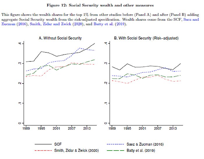
Subsequent analyses confirm this view—or are even more sanguine—after accounting for private and public retirement wealth (which affects not only future living standards but also current ones). A 2020 paper from several University of Pennsylvania researchers, for example, adjusts several prominent wealth inequality studies to include Social Security and finds that “top wealth shares have not increased in the last three decades when Social Security is properly accounted for.”
A brand new paper from the Boston Federal Reserve makes similar findings: standard measures of household net worth (and thus wealth inequality) routinely omit the value of retirement funds—defined benefit plans (e.g., pensions or annuities), defined contribution plans (e.g., 401ks or IRAs), and social security—and thus significantly understate the wealth of most Americans and overstate U.S. wealth inequality. When these widely-held benefits are included, the share of wealth held by the top 5 percent drops from about 72 percent to 45 percent in 2019, and its growth since 1989 goes from 18.2 percentage points (53.3% to 71.5%) to just 10.2 percentage points (35.2% to 45.4%). The Boston Fed authors also find—somewhat incredibly—that approximately one in four Americans aged 40 to 49 was a millionaire in 2019 when you include the present value of their retirement benefits in total their household net worth. (The total is almost certainly even higher today, given what’s happened to home prices and the stock market since 2019.) As economist David Weil notes, adding other forms of government “transfer wealth” would further improve these results.
So, once again, troubling depictions of wealth inequality—often cited to justify more government redistribution—become far less troubling after considering the full picture of people’s wealth, especially existing government redistribution programs.
Real People Matter Too
The last issue worth considering is how inequality assessments often fail to track individuals’ actual experiences and choices. So, for example, we’ll see “troubling” trends for generic buckets of people in the same income or wealth brackets (the “one percent” or the “99 percent” or whatever), even though the actual people in those buckets change regularly—especially over the long time horizons used in the inequality literature. As we discussed last year regarding widespread (and misguided) allegations of “income stagnation” and “wage polarization,” the standard “buckets” (or “cross-section”) approach can significantly distort one’s assessment of how the U.S. economy is actually performing across decades—a real-world performance that can only be determined by tracking real people (a “panel approach”). This includes, as Cochrane explains (again citing Auten Splinter), analyses of income inequality:
Suppose, for example that everyone stays the same over a lifetime, but that wages grow faster over time. The poor (young) would be poorer and the rich (old) richer, but yesterday’s poor are today’s rich, and the distribution of lifetime income unchanged. That’s not what happened, just a story to illustrate the confusion.
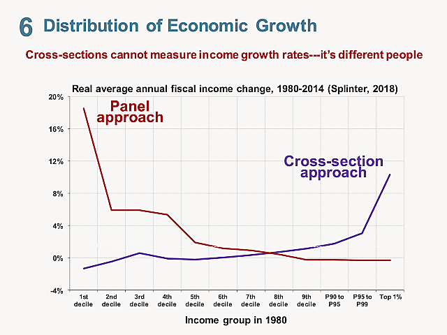
The “cross section” approach looks at income growth of each percentile, i.e. how much is the income of today’s top 1% different from the 1980s’ top 1%. It does look like “the wealthy got all the gains.”
But the “panel approach” looks at the experience of actual people. If you look at people who were in the first decile in 1980, how much has their personal income grown over time? We see the opposite pattern. People who had very low incomes saw much more growth.
Thus, when you consider the actual experiences of actual Americans between 1980 and 2014, you see far more growth at the bottom—not the top—of the income distribution.
Another issue often overlooked is how Americans’ individual behaviors and choices can affect their incomes (and thus inequality). So, for example, economists recently found that a significant chunk of wage inequality comes from differences in performance-based pay (e.g., overtime, commissions, bonuses, or tips) within the same occupation (e.g., realtors or construction workers). And slicing and dicing 2019 Census Bureau data, AEI’s Mark Perry shows how various household demographic issues and choices (age, marital status, earners-per-household, education, etc.) are “all very highly correlated with American’s household income.” He concludes that:
[T]he key demographic factors that explain differences in household income are not fixed over our lifetimes and are largely under our control (e.g., staying in school and graduating from high school and college, getting and staying married, working full-time, etc.), which means that individuals and households are not destined to remain in a single-member, low-income quintile forever. Fortunately, studies that track people over time find evidence of significant income mobility in America confirming that individuals and households move up and down the income quintiles over their lifetimes, as the key demographic variables highlighted above change…
Where people choose to live can also affect their incomes and inequality. And numerous studies show that gender-based differences in incomes often result from workers’ choices (about overtime, experience/tasks, advertised pay, etc.), not systemic or more nefarious factors.
Sometimes, the simplest “inequality” conclusion is the correct one: People are just different.
Summing It All Up
Whether it’s income, the “labor share,” or wealth, numerous studies by respected academics rebut the scary headlines and beltway conventional wisdom about rampant inequality in the United States. Once you account for various government interventions, consider demographics and personal choices, and make other necessary adjustments, the increase in inequality since the Good Ol Days—you know, back when unions were strong and globalization modest—has been, at best, non-existent and, at worst, moderate (and the result benign things like stock market performance and housing wealth, not populist bogeymen like monopolies or systemic discrimination). That politicians and pundits in Washington continue to use “inequality” to vilify capitalism and justify their new government programs—often ignoring the current programs already in place!—is telling (and not in a good way).
And this doesn’t even get into whether Americans really care about inequality—or whether they should. On the former score, polls repeatedly show that majorities don’t consider inequality to be a serious issue that economic policy should prioritize. As Saez himself has noted, “In America, people do not have a strong view against inequality per se, as long as inequality is fair.” On the latter, there’s plenty of evidence showing that economic inequality—to the extent it does exist—isn’t primarily the result of ill-gotten gains by the super-rich, nor does it affect individuals’ material or subjective well-being or corrupt American politics. And government efforts to target and reduce market-based inequality could actually backfire by lowering living standards and fomenting class envy and cultural strife.
That’s not to say, of course, that the current system is ideal. For starters, some inequality actually is the result of lawful-but-bad behavior—most notably, cronyism, rent-seeking, and barriers to competition that have likely grown in tandem with the size of the state (at all levels). It’s hard to imagine, however, how even more government intervention—inevitably implemented via complex, subjective regulations that only large corporations and the ultra-wealthy can afford to navigate—will fix this type of inequality. (Indeed, the big guys often beg to be regulated for this very reason.)
Second, Gramm and Early note that “[a]s government transfer payments to low-income households exploded, their labor-force participation collapsed and the percentage of income in the bottom quintile coming from government payments rose above 90%.” We can—and should, I think—be concerned about a system in which government payments represent a large and increasing share of poorer Americans’ income—and how such payments affect Americans’ life and work decisions. But this is the reality we have, and it’s especially important to portray it accurately, given that inequality is so commonly used to argue for an even more progressive distribution of taxes and transfers and even more government meddling in the market. In that regard, there’s just not much to worry about—unless, of course, you need to push an agenda or win an election.
Chart of the Week
Bonus Chart of the Week
Boom, as the kids say (source)
The Links
Me, on Operation Warp Speed and industrial policy, plus a new podcast on trade, dynamism and prosperity
Walmart will pay 100% of its workers’ college tuition and books at select universities
More evidence Blackrock isn’t buying all the houses
How Unemployment Insurance Fraud Exploded During the Pandemic
Seafood prices have gotten fishy
Is the Fed’s QE fueling asset bubbles?
“China is struggling to create enough suitable jobs for its more highly educated young people”
Crocs are so hot right now that they’re filing IP claims
UK goes all-in on high-skill immigration
Monopoly Watch: “Snap and Twitter’s earnings point to just how huge the digital advertising market is” and “Businesses and governments are signing up for a mix of [cloud] providers, cherry-picking features and playing the vendors off against each other to keep costs down”
And VCs say “Big Tech” bills will chill startup investment
Miners score rare, albeit limited, win in lithium case filed by U.S. environmental groups
Surprising no one, unions oppose U.S. rejoining (CP)TPP
About the Author
