Dear Capitolites,
Given all of the policy wonkery that arose last week, especially at the presidential debate, this will be the first in a four-part series detailing each major issue that—hahahahaha.
Anyway, back to reality. A frequent response to articles like last week’s criticism of Trump’s tariffs is “Okay, so tariffs don’t work, but what would you do about the stagnation of middle class incomes?” (Often a “smart guy” is thrown in there somewhere.) It’s a difficult question because tariffs’ harms and inefficacy are a sufficient reason to avoid them, and, more importantly, because middle class incomes aren’t actually stagnating.
No, really. They’re not.
This might come as a surprise to many readers who for years have listened to politicians and pundits decry income or wage “stagnation” as one of the biggest problems of our time (and a big reason why capitalism or “libertarian economics” or whatever needs to be jettisoned). It’s a conventional wisdom that arose, in my opinion, because: (1) popular, but inaccurate or incomplete, measures of “middle class incomes” once showed stagnation; (2) few people updated their priors when new, more accurate data emerged; and (3) by that time the “stagnant incomes” talking point had become embedded in the national political psyche.
But it’s (mostly) wrong. In general, inflation-adjusted incomes for all groups—rich, poor, and in-between —have been increasing for decades, and the middle class is “disappearing” into higher income brackets.
Today we’ll try to break through the mania and examine several ways that incomes might have appeared “stagnant” in the past, and why it’s so important to get this right today.
Timing
One of the simplest and most common “income stagnation” errors is the assessment of trends over cherry-picked periods of time—especially ones that start at the peak of a business cycle and end in the trough. This was particularly a problem during and immediately following the Great Recession, which did a real number on incomes (and pretty much everything else) to a much greater extent, we now know, than we realized at the time. Numerous analyses simply ignored that fact and presented income and other economic data as if recession-induced nadir were the new normal. It rarely (if ever) is.
It’s thus critical to examine all economic trends—including incomes—between similar points in the business cycle or over as long a period as possible (to let readers see the trends for themselves). For example, if you looked at a common measure of income—real (inflation-adjusted) median household income from the Census Bureau—between 2006 and 2014, it looks really bad. However, if you extend the exact same series to the maximum period provided in the St. Louis Fed’s FRED database (1984–2019), the picture changes:
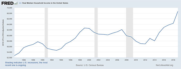
All of a sudden, the “stagnation” we were told was the New Normal disappears over the longer term, as generational gains absorb the troughs tied to temporary recessions.
As discussed next, however, even this more optimistic series is too pessimistic.
Tracking Individuals Versus Tracking Groups
Another common problem with “stagnation” analyses is that they look at the experiences of certain groups over time instead of the actual people within those groups. Doing so raises all sorts of concerns because, while the groups remain the same over time, their actual composition can change dramatically. As such, analyzing the group, instead of the people in the group, is like judging Brett Favre’s quarterbacking skills since the ‘90s by just tracking the Packers quarterback stats. (Spoiler: Even with numerous copper fit braces, the ol’ Gunslinger’s not as good as those 2019 quarterback stats claim. Instead, the Packers’ QB statistics since Favre’s retirement have come thanks to his replacement Aaron Rodgers, one of the most accurate quarterbacks in NFL history.) And yet it happens—a lot.
Economist Russ Roberts hit on some of these problems in a 2018 blog post:
Many of the most pessimistic studies about the fate of the American middle class ignore the changes in the American family since the 1970s and the effects [they] have had on the way we measure changes in household income. … But the biggest problem with the pessimistic studies is that they rarely follow the same people to see how they do over time. Instead, they rely on a snapshot at two points in time. So for example, researchers look at the median income of the middle quintile in 1975 and compare that to the median income of the median quintile in 2014, say. When they find little or no change, they conclude that the average American is making no progress.
But the people in the snapshots are not the same people. You can’t use two snapshots to conclude that only the rich have made progress. It’s possible that everyone from the earlier snapshot has actually gotten richer and then been replaced by different people whose incomes will also rise. This is especially true when there is immigration. If new immigrants are disproportionately less skilled than Americans already here, measured incomes can fall even when those who are already here have steadily improving economic prospects.
And when marriage rates are falling and people are increasingly living on their own, household income can fall while every individual is doing better. Estimate[s] of economic progress based on household income are distorted by these effects.
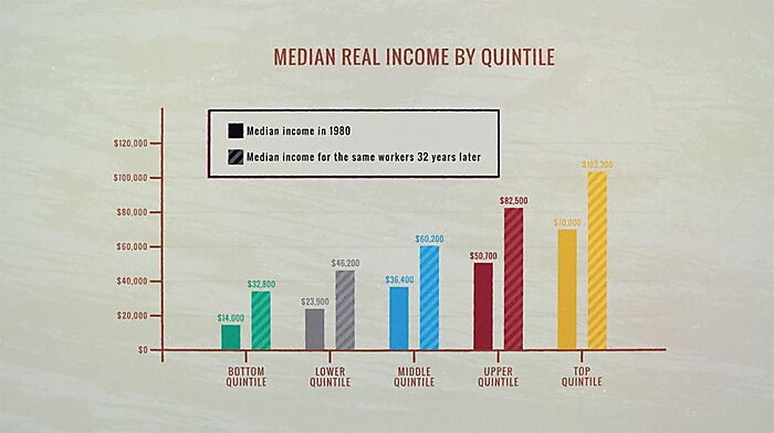
Roberts provides several studies showing how tracking actual people, not groups, improves wage and income performance considerably, so I invite you to go there if you’re really interested in the issue. This chart is probably the most instructive:
As Roberts also notes, “household” changes matter too—and contrary to the conventional wisdom, the “proportion of households with two earners has actually decreased since 1980… because while more married couples are households where both spouses are working, the marriage rate has fallen.” Thus, unadjusted “household” trends can paint an inaccurate picture of changes to the individuals within those households over the same time period. It’s thus essential to adjust the household (which raises all sorts of other questions) or, even better, just to examine individual experiences (even when it’s not the same individuals).
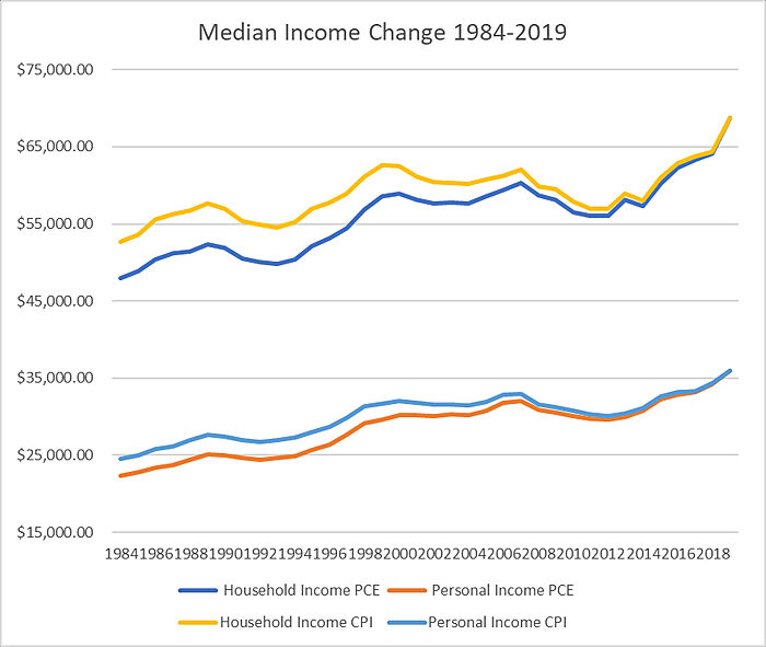
Doing this for incomes shows additional gains. For example, the first chart of real household income showed a decent, 30 percent increase between 1984 and 2019, but real personal income shows a 47 percent change during the same period:
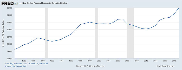
In short “households” gained a little, but individuals gained much more. Starting to get undepressed yet?
A similar problem occurs when economists track job categories instead of the actual experiences of people in those jobs. For example, a prominent strain of research on “wage polarization” examines employment trends at the occupation level, essentially categorizing occupations as high‑, middle‑, or low-wage and then counting them over time. Based on this approach, many economists have found occupation- based “employment polarization,” i.e., increases in high and low-paid occupations and a relative decline in middle-paid occupations, in the United States. But these economists never stopped to ask what actual wages the actual individuals within these occupations were actually making.
As I explained in a recent Cato blog post, more accurate approaches change the “polarization” narrative entirely and show that “while the American middle class is indeed shrinking, this trend has been caused less by ‘polarization’ (i.e., Americans moving both up and down the economic ladder) and more by Americans simply getting richer.” Here’s the clear evidence from one such study:
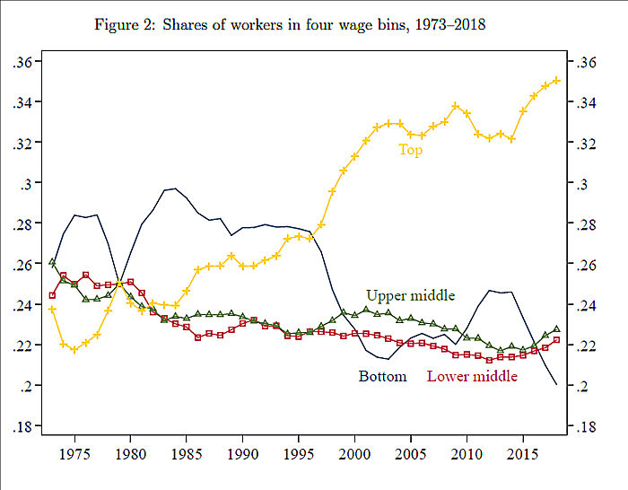
As you can see, the general trend since the 1970s is more people entering the top wage bracket and fewer people in the others. That’s good news, too.
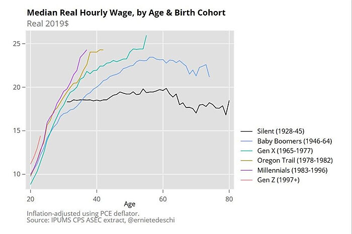
Finally, there’s the issue of just looking at broad income groups without considering the various ages of people within those groups. As I noted last week, labor economist Ernie Tedeschi has provided several breakdowns of income by ages/generations, each of which punctures the conventional wisdom about stagnant wage and income gains among millennials and Gen Z:
Inflation
Another common issue is how to measure inflation in order to make an apples-to-apples comparison of nominal compensation (what your paycheck says) over time. If inflation is higher, you’ll have lower real income gains over time as the cost of living eats into any nominal (paycheck) gains. As documented by economist Scott Winship, the most common inflation gauge—the Consumer Price Index (CPI)—overstates inflation and therefore causes real wage gains to appear smaller than they actually are. (The aforementioned census tables use CPI.) Using the better “deflator”—“personal consumption expenditures” (PCE), which many other government organizations use—reveals significantly higher real income gains.
So if we recalculate the aforementioned household/personal income figures from the census, using the standard PCE deflator, the already-decent 30 percent (household) and 47 percent (personal) increases between 1984 and 2019 improve to 43 percent and 61 percent, respectively:
That’s pretty good.
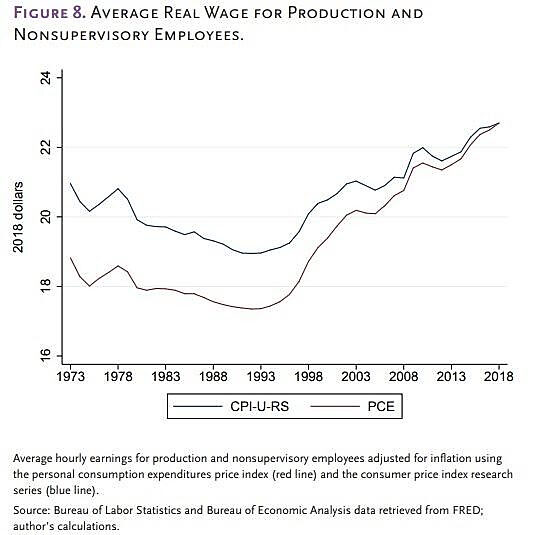
AEI’s Michael Strain recently applied the same approach to production wages alone (more on that in a second) and came to the same conclusion: “Over the past three decades, wages for typical workers have grown by 20 percent using the CPI. And using the PCE— the better measure of inflation— finds a one-third increase in wages.” (He also rightly notes that all of the wage “stagnation” occurred in the 70s and 80s, not recently.)
Wages vs. income
Finally, there’s the question of what we mean by “income” at all: just wages? Wages and benefits? Wages, benefits and government transfers (tax credits, welfare, Medicare, etc.)? This matters because (as we noted two weeks ago) tens of millions of Americans receive a government subsidy, many more than just one, and because non-wage compensation is an increasingly big chunk of American workers’ total income (i.e., the flow of all resources into a household that can be used for consumption and saving):
The average worker received 32 percent of total compensation in benefits including bonuses, paid leave and company contributions to insurance and retirement plans in the second quarter of 2018. That was up from 27 percent in 2000, federal data show. The rising cost of health insurance accounts for only about one-third of the trend. And the data do not include the increased prevalence of non-monetary benefits like flexible hours or working from home, or perks like gyms and “summer Fridays.”
So if employer compensation is increasingly in the form of non-wage benefits (benefits that many workers want or that many employers are required by the government to provide), then wage growth will be smaller than it would have been if employers simply paid in cash (employers don’t have a money tree, after all). Thus, for example, a worker making $30,000 in 2014 had to forgo a $7,800 pay raise (26 percent of her salary) due to increased health insurance premiums paid by her employer, but her wages alone captured none of this real compensation.
Similar issues arise with government transfers, which have also increased over the last few decades: If poor and middle-class Americans are getting more government transfers than they were in the past, then their increase in total, real-world income each year will be bigger than the annual increase in just wages.
The Census Bureau figures that I recalculated above include employer-paid benefits and some government transfers, but not all of them (as Winship explained a few years ago):
The official [Census Bureau income] measure includes cash benefits from the federal government, things like unemployment insurance, social security and temporary assistance for needy families, but doesn’t include non-cash benefits, like food stamps or Medicaid and Medicare and it doesn’t take into account taxes. So when part of the federal response to the recession was to reduce taxes, particularly the payroll tax, that isn’t incorporated into the official measure.
So my figures (and Strain’s on wages) would be even better if we added the increasing tax and non-wage benefits from the government. I don’t have the data available to do this myself for the Census figures (I don’t think it exists), but Strain provides proof of how this can affect income trends when looking at similar data from the Congressional Budget Office (CBO):
The nonpartisan Congressional Budget Office computes three income series. Market income is defined as labor income, employer-provided health insurance, business income, and capital income, along with retirement income for past services. Income before taxes and transfers is market income plus social insurance benefits, including Social Security payments, Medicare benefits, and payments from unemployment insurance, Social Security Disability Insurance, and workers’ compensation. Finally, income after taxes and transfers is income before taxes and transfers plus means-tested transfers (e.g., Medicaid and Children’s Health Insurance Program benefits, food stamp benefits, and Supplemental Security Income) minus federal taxes. … Median household market income increased by 21 percent between 1990 and 2016, the last year for which data are available. Like median wage growth, this is not spectacular and is less than household income for the top 1 percent. But it is not stagnant. (And if we had data for 2017 through the present, this growth would look even more impressive.) The median household saw market income plus social insurance benefits increase by 28 percent from 1990 to 2016 (figure 10). And the most comprehensive measure of the income actually available to the median household to spend and save— income after taxes and transfers— grew by 44 percent over this period.
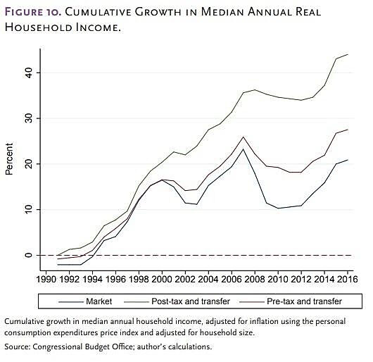
These already-good figures would undoubtedly be even better if they were extended through 2019.
Why It Matters
So middle-class wages and incomes haven’t been “stagnant” after all. Why does it matter? Well, beyond just getting our facts straight, there are at least two reasons:
First, due to a longstanding combination of pessimistic bias (we tend to exaggerate the likelihood that bad things will happen), confirmation bias (we tend to find or agree with information that confirms what we already believe) and “hedonic adaptation” (we quickly get used to improvements in our living standards), most people are primed to accept bogus narratives from political elites about their living standards (including incomes). This can fuel public support not just for bad policies, but for bad people—i.e., demagogues targeting fake enemies and promising simple fixes to complicated life problems (or ones that don’t actually exist at all). By contrast, being armed with the actual facts—good and bad—allows us to better distinguish bad from good (both policies and politicians).
We could certainly use more of that today.
Second, and relatedly, not all of our economic and social concerns are bogus. But to fix the real problems, you first have to weed out the fake ones. So, for example, if middle-class income gains are actually pretty good but are also increasingly eaten up by non-wage benefits (especially health care costs), or if millennials are actually pulling in good (generationally great) incomes but face serious cost-pressures due to student loan debts or housing costs (or whatever), then policymakers should stop worrying about incomes so much (e.g., through wage mandates, jobs programs, or punitive wealth taxes) and instead start asking, “Why are health care costs out of control? Why are housing costs and student debt so high? And what can we do to improve these problems?”
Indeed, trying to fix cost issues through income policies is like buying new pants after a year-long, Homer-In-Hell doughnut diet. I guess it “works” for a time, but it doesn’t actually target the real problem and you’re just gonna be back at the pants store (just go with it) again next year.
Other real problems facing the American middle class could include, for example, the increasing importance of education for upward mobility in the United States (or maybe our obsessive focus on four-year degrees), or the challenges that specific communities face after decades of disruption (though many have moved on). And certainly we need to reconsider how central bank and monetary policies have increased past recessions’ depth and duration (and hurt workers in the process). But, again, these very real challenges are very different, and more nuanced, than the populist narrative about nefarious elites and multinational corporations enjoying the spoils of unfettered capitalism while the middle class “stagnates.” They also don’t lend themselves to simple fixes and often require local (not federal) policy responses, such as eliminating occupational licensing, land use, or other regulations that stifle mobility.
By avoiding the wrong debates on the wrong issues, voters and (hopefully) U.S. policymakers can focus their attention on these real challenges and start supporting/proposing real reforms—and maybe we can save the populist and anti-capitalist uprisings for another day.
* * *
P.S. Of course, just as I was finishing this newsletter, the CBO published the latest income (2017) data. You can review it for yourself here, but—fear not!—it shows the same optimistic trends as last year. (For example, Strain’s median income calculation (1990–2016) goes from 44 percent to 46.2 percent when extended through 2017.)
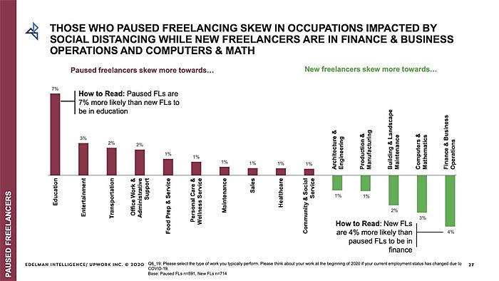
Chart of the Week
This entire report on freelancing and remote work is fascinating, but this chart is probably my favorite:
The Links
Me on big business and farm subsidies
Manufacturing output has recovered; jobs, not so much
Clean tech subsidies aren’t working so well
People need to stop assuming big governments necessarily handle COVID-19 better
Plain packaging mandates actually encouraged more smoking
Do car seat mandates discourage third children?
“Demographics and Debt Hang Over Long-Term U.S. Growth”
About the Author
